NEW: SG AI – YOUR AI ASSISTANT FOR TYPO3 – SEO, (IMAGE-) TEXT, IMAGES & MORE!
Grid Elements
The TYPO3 extension 'gridelements' allows to create containers for other content elements. The extension applies the grid layout concept to normal content elements – the grid elements. Raster elements are used to structure pages. As containers, they do not contain any content themselves, but can be filled with any other content elements. Especially when a lot of information has to be presented clearly and consistently on a website, grid elements are perfect for creating a clear structure and order.


Grid elements can be used to create a 1 to 4 column grids. The width of all columns together corresponds to the total width of the content area of a page. The distribution of the columns can be changed and adjusted at any time.

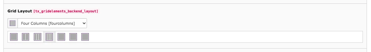
You will recognize the four symbols with columns when you create a grid element. The fifth symbol will appear in the content area.
Tab General
The General tab of the grid elements contains the same fields as in the header element. Unlike other elements, grid elements cannot be converted to another grid element in the Type field. A grid element can only be adjusted to other content elements there.
Grid Layout
For example, to turn a Two Column Element into Four Columns, use the option under Grid Layout in the General tab. The current grid element is already selected. To change the grid element, simply click on the symbol of the desired grid or select it from the drop-down menu. You must then confirm the change.
If there was already content in the columns, their position can be adjusted in the Grid Elements tab. Learn more about the Grid Elements tab.
Plugin Options
The plugin options are partly different depending on the number of columns in the grid. The width of the columns can be adjusted. While the options for column height and alignment of the contents are the same.
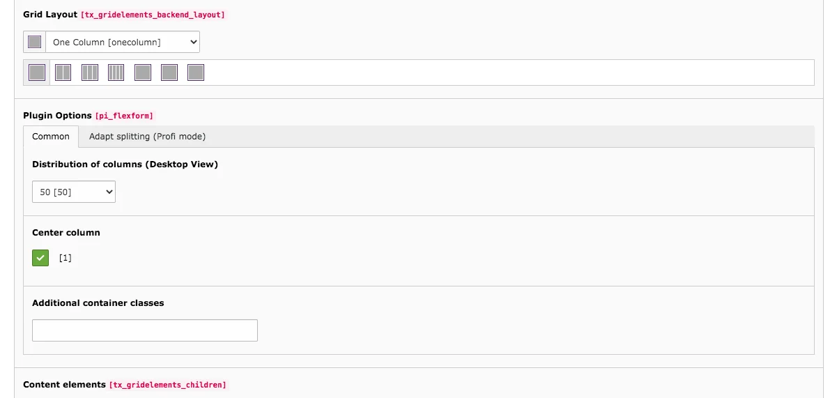
One Column – Distribution of Columns
A One Column element can have different widths and can also be centered. Possible widths in percent are:
100 %, 75 %, 50 % or 25 %
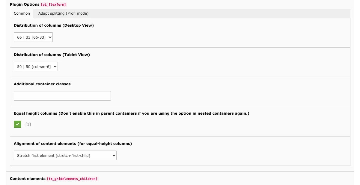
Two Columns – Distribution of Columns
With a Two Column element it is possible to set the distribution of the columns for the desktop and tablet view.
Distributions in percent in the Desktop View:
50 % and 50 %, 66 % and 33 %, 33 % and 66 %, 75 % and 25 % or 25 % and 75 %
Distributions in percent in the Tablet View:
50 % | 50 % or 100 %
With the 100 % option, the two columns appear below each other instead of next to each other.
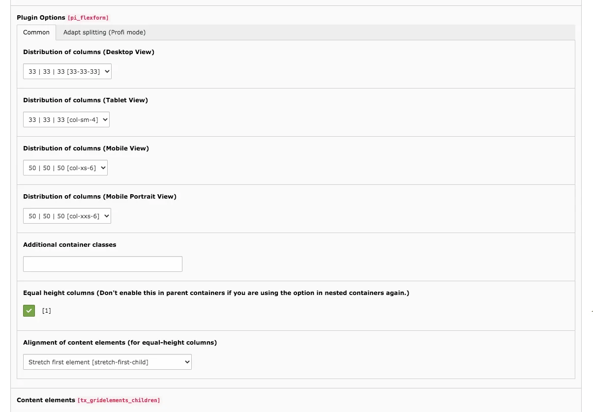
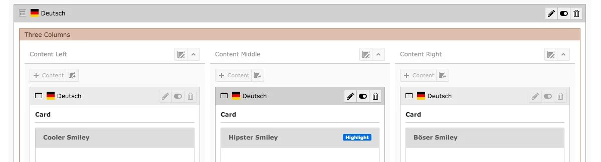
Three Columns – Distribution of Columns
The Three Column elements offer the most customization options for column widths.
Distributions in percent in the Desktop View:
33 %, 33 % and 33 % or 50 %, 25 % and 25 % or 25 %, 50 % and 25 % or 25 %, 25 % and 50 % or 15 %, 70 % or 15 %
Distributions in percent in the Tablet View:
33 %, 33 % and 33 % or 50 %, 50 % and 50 % or 100 %
Distributions in percent in the Mobile View: 50 %, 50 % and 50 % or 100 %
Distributions in percent in the Mobile Portrait View: 50 %, 50 % and 50 % or 100 %
Four Columns – Distribution of Columns
There are no options to adjust the distribution of the columns in the Four Columns Element.
The columns are automatically distributed evenly, since they are very slim anyway.
In the mobile and tablet view, either two columns are displayed or all four columns are displayed below each other.
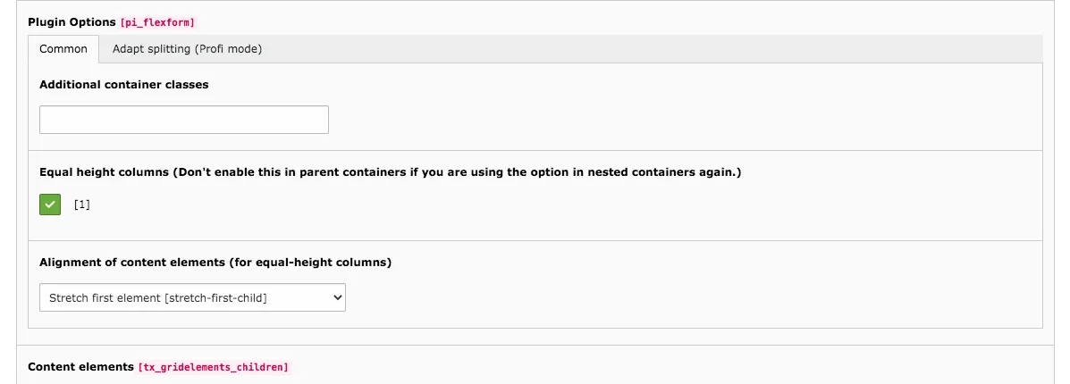
Equal height columns & Alignment of content elements
From two columns on, there are also options to adjust the column height uniformly and to determine the alignment of the content elements, provided that they have the same width. In the dropdown menu for alignment, you can choose from the following options:
- Stretch first element
- Stretch last element
- Align elements at the top
- Align elements at the bottom
- Center all elements
- Distribute elements equally
Content Elements
As soon as you insert content elements into a grid, they appear in the Content Elements column. You edit them directly if you are in edit mode of the grid element, or you edit the elements individually, as you do with content outside of grids.
One, Two, Three or Four Columns in Frontend
On our preview page you can see grid elements in use in many places. The one, two, three and four columns are often the basis for the presentation of other content elements.


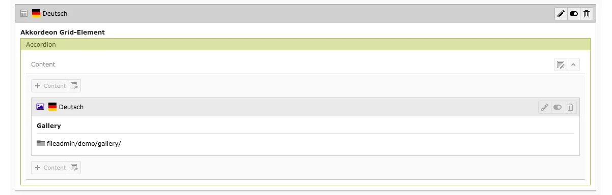
The grid element accordion differs from the mask element of the same name essentially by the fact that the grid can be filled with all content elements, while the mask element can only contain text. Thus, a grid accordion can contain more content and can be designed more freely.
Tab General
As with the one to four column elements, you will find the header customization fields, grid layout options, plugin options and content elements in the accordion element.
With grid layout, you change the grid element to another grid (e.g. two columns or box). If the current element is to be converted into another content type, you do this in the Type field.
In the plugin options, you can only decide whether the accordion should already be expanded when the website is called up. By default, the content is not visible. The accordion line can be expanded in the frontend by clicking in the field/row.
In the Content Elements field is a list of all the content that is in the accordion.

Accordion in Content Area & in Frontend
Each accordion grid element that you create in the backend corresponds to a line on the TYPO3 page that you can expand and collapse. The accordion is well suited for displaying a large amount of information in a structured and clear way.
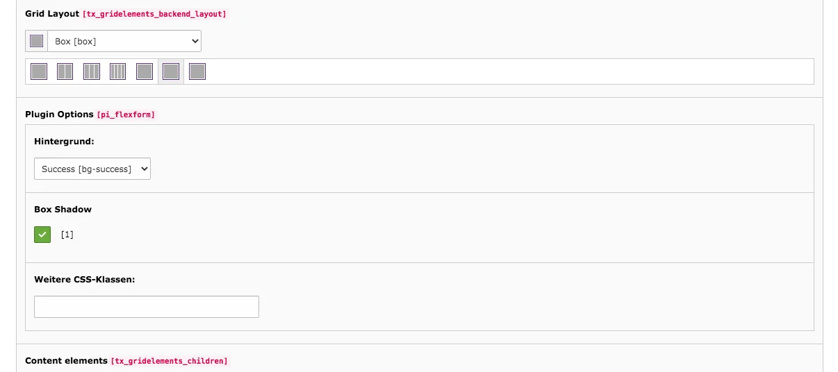
Boxes are used to highlight content or to distinguish it from other information. As grid elements, you only specify a frame which can be filled with almost any content element. You will encounter the first symbol when you want to create the content element box. The second symbol will appear in the content area.
Tab General
As with other grid elements, in the box's editing mode you will find the grid layout, plugin options and content elements fields in the General tab.
In grid layout, you convert one grid element to another. The plugin options of a box provide the fields to change the background color and to set a shadow around the box.
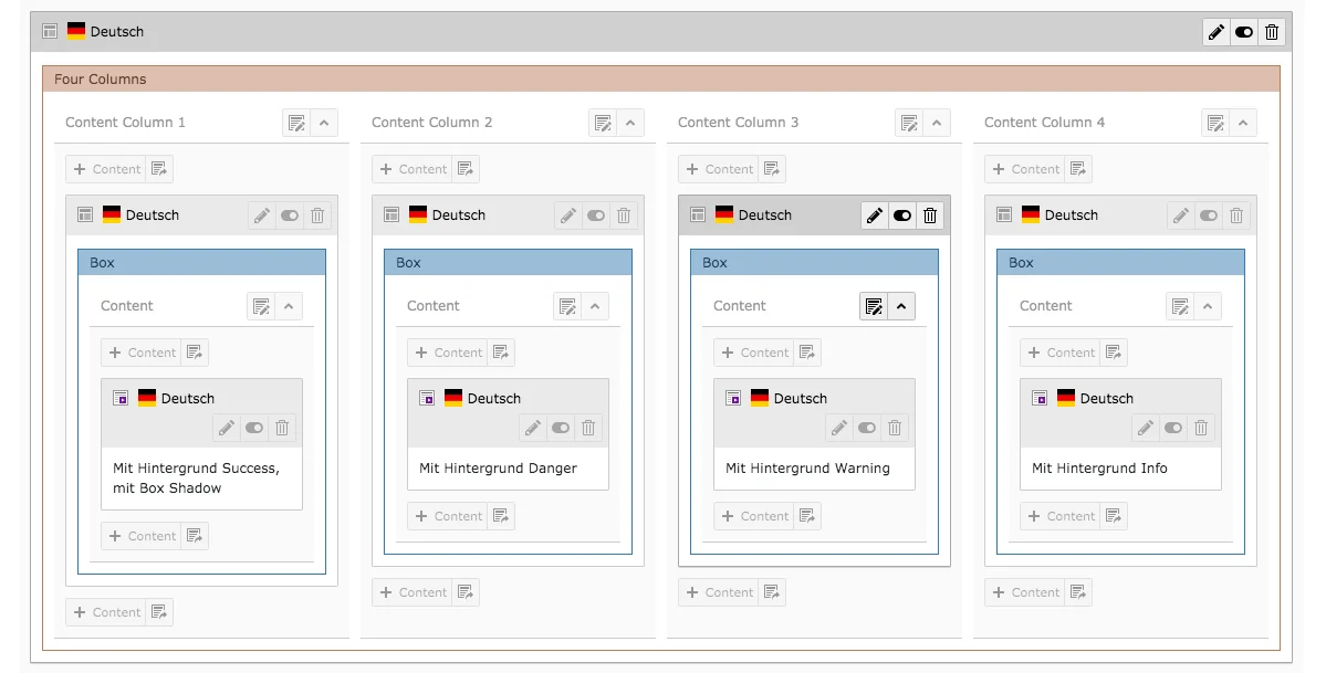
The content in the boxes shown in the image below appears in the edit mode of each box.
To edit the content, go to the edit mode of a content element directly in the content area using the pencil icon or use the Content Elements list when editing the box.
Box in Frontend
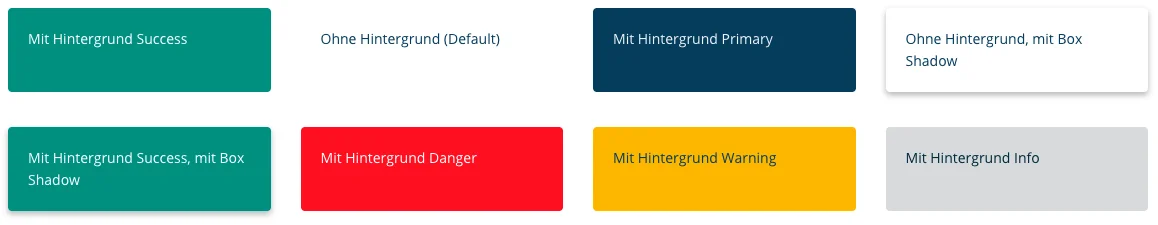
You can see on our preview page which backgrounds you can set by default in our website base and how boxes with shadows look like.
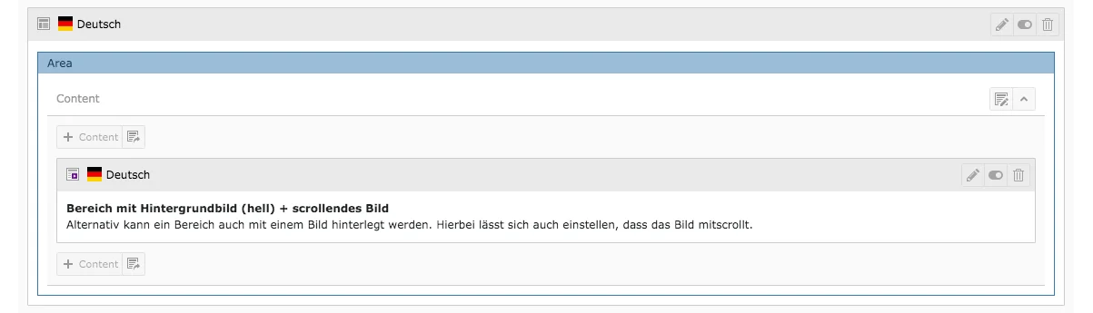
Areas can be filled with almost any other content elements. In contrast to boxes, areas take up the full page width. You can also set background images for areas. You will encounter the first symbol when you want to create the grid element Area. The second symbol will appear in the content area.
Tab General
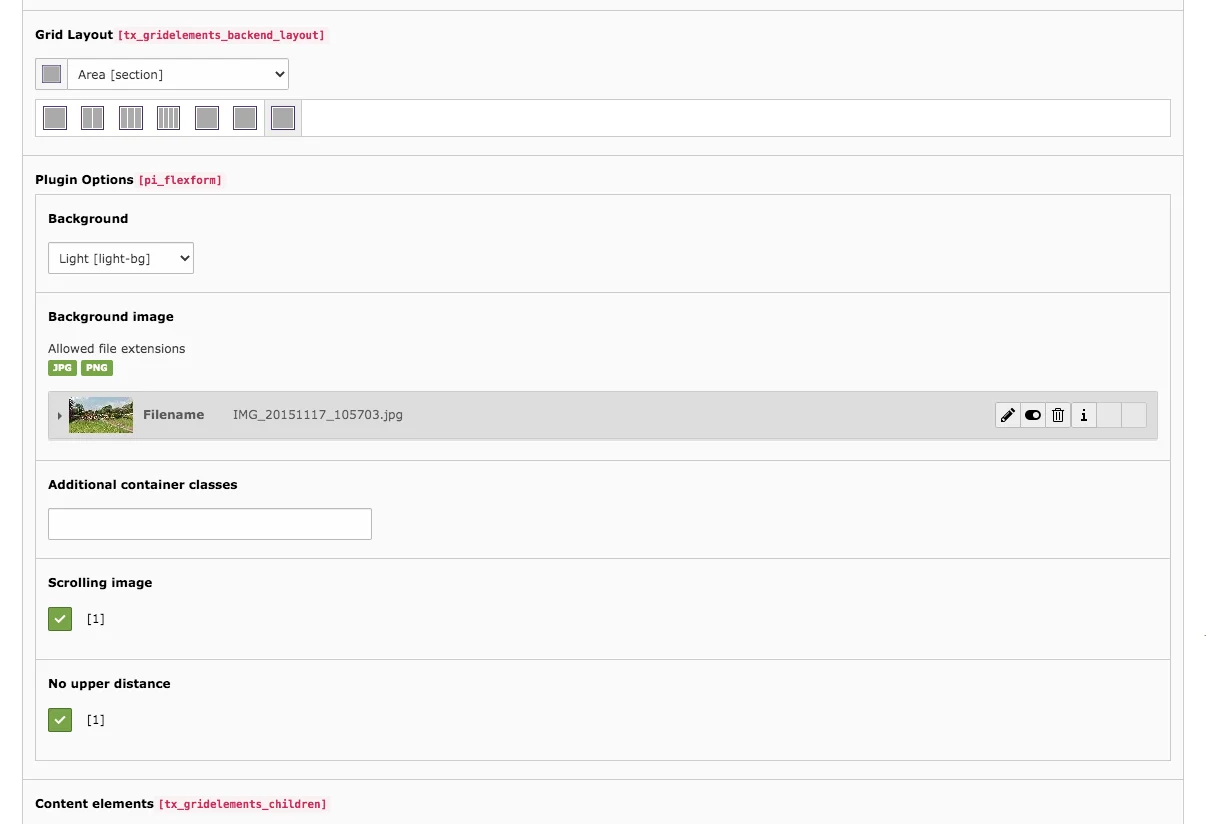
When you edit the Area grid element, you will find the Grid Layout field in the General tab. Here you can convert the current grid to another one.
Below this there are the plugin options. As with the box, a background can be defined. This can be light or dark. The default setting is transparent. In addition, a background image can be added. If you activate the light or dark background with a background image, the background image will be overlaid over the image (background image will appear lighter or darker). The screenshot from our preview page shows how this may look on the website.
To insert a background image, proceed as follows:
- Upload the image in the File List module. Go to the plugin options field in the editing mode of the area element and click the Create new relation button.
- The picture is already uploaded: Click on the folder where the image is located.
- The picture has not yet been uploaded: Select the folder in which you want to upload the image and click the Upload Files button (below the list of already existing files). Select the desired image from your hard drive and click on Open to upload the file.
- Click on the required file that is in the list.
In the field Content elements all contents that are located in the area are listed, these can be edited directly there or selected individually via the content area.
Area in Frontend
The screenshot from our preview page shows how an area can look like on a website.

Would you like to know more?
All information about the available editions can be found on the webpage for our TYPO3 Website-Base. You have the possibility to get a Website at a Fixed Price or you decide for a Website as a Service package, with which no further costs for hosting or security and function updates will come up to you.
