NEW: SG AI – YOUR AI ASSISTANT FOR TYPO3 – SEO, (IMAGE-) TEXT, IMAGES & MORE!
Website Configuration
The Website Configuration module is our design configurator, which allows you to customize the logo, colors, fonts and font size of your online presence without programming knowledge.
With the design configurator you can easily adapt the colour of your page to your corporate design. You create different colour sets and apply them. If the company's font, colours and/or logo change, the design can be easily updated without losing content.
By clicking on the module you will get to a view with five tabs, which are presented in more detail below. Above the tabs you can see options that are always available.
Use the blue button Save Changes to save your settings. You must always do this if you want to see how the change affects the frontend.
Note: When you exit the module, no save hint is shown! To save changes, you should always save in between.
The Reset Configuration button resets all settings to the default value. To view the page in a new window, click Open Preview in new Window.
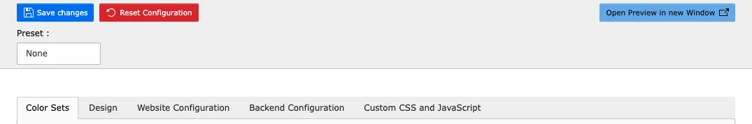
In the drop-down menu of Preset you will find three color sets: Dark, Default and Ocean. None is the default setting and is automatically selected as soon as you have made changes to a preset. This means that the presets cannot be changed, but can be customized.
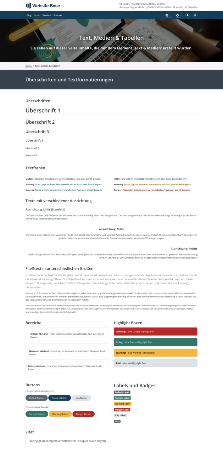
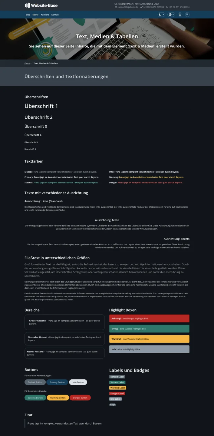
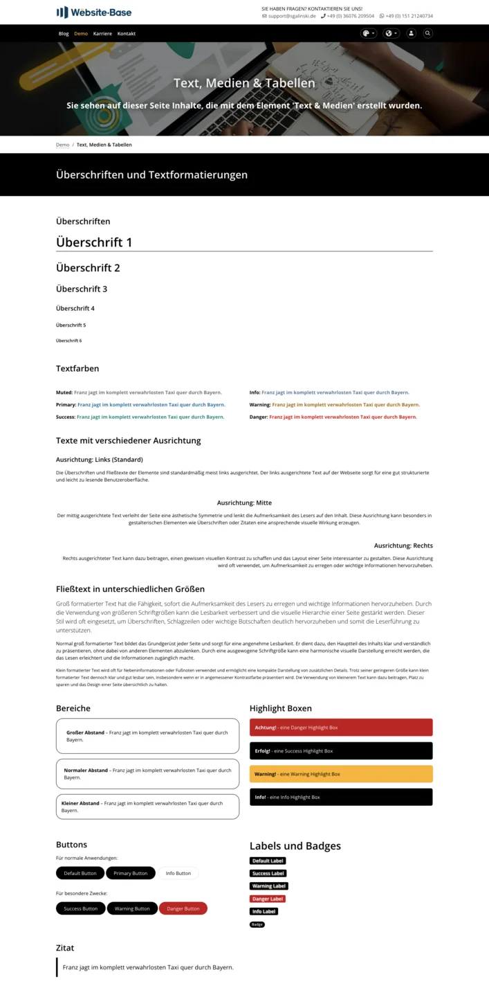
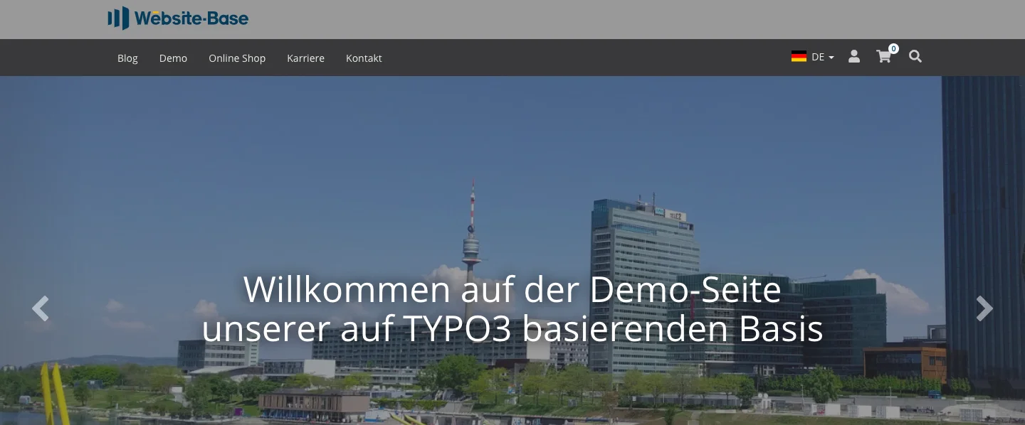
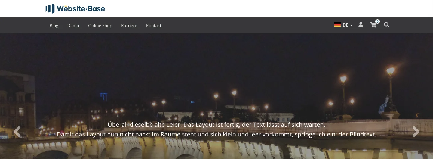
The screenshots show the standard color settings and the different modes of our Website-Base.
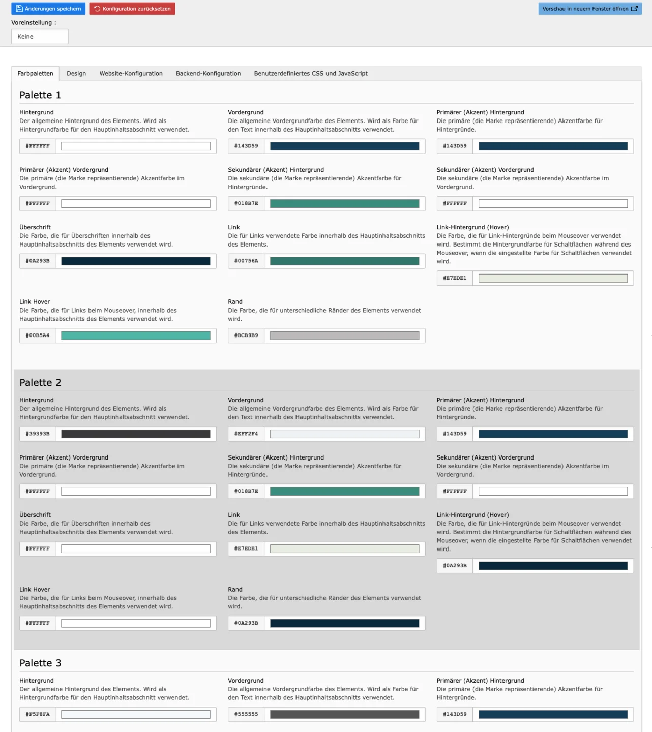
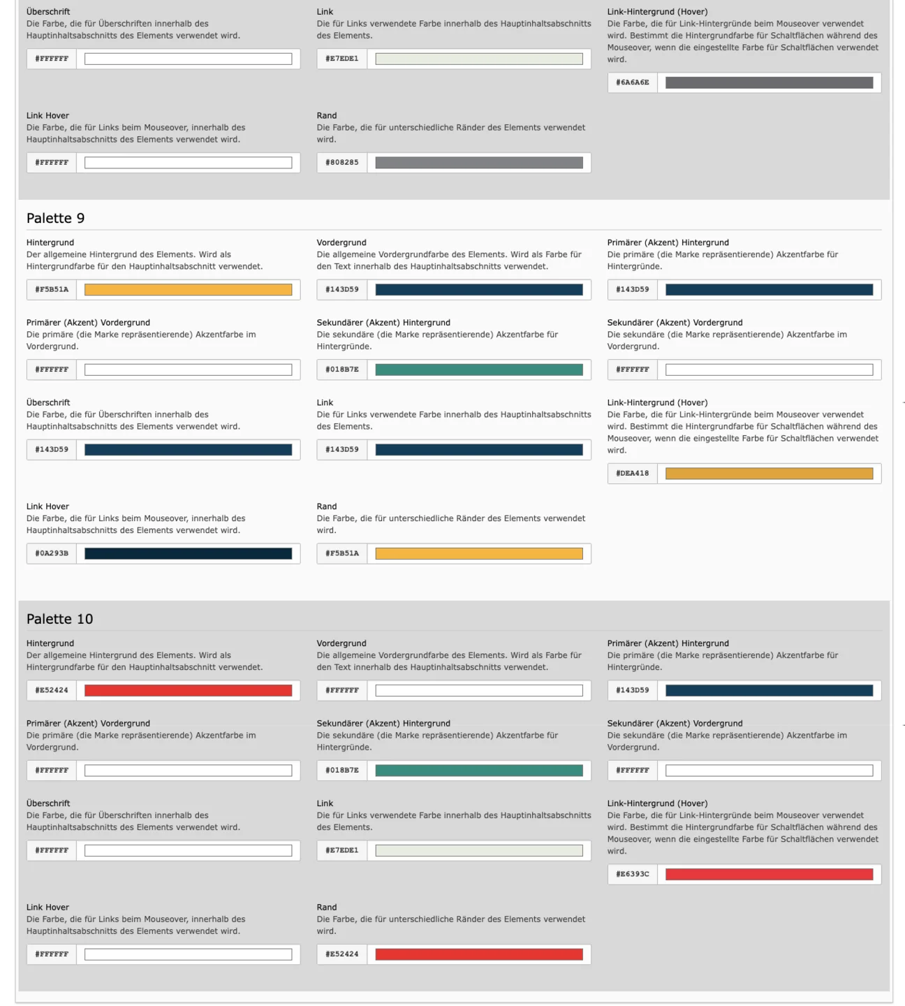
Color Sets allow a very individual combination of colors. In this tab you see 10 color sets. But you don't have to use and adjust all of them. Because in the tab Design you then set which Color Set you want to apply where. So theoretically it would be possible to use only one Color Set. Before you adjust the sets, it is best to familiarize yourself with the Design tab!
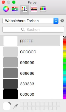
Each color set has 11 colors that can be adjusted. When you click on a color set, a window for configuring the color appears on the side. You only have to choose a color from the color palette or enter a color code. We will now show you which field causes which changes in the frontend.
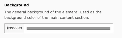
Background
You can see in the screenshots that this color setting is the main background. For comparison, you can see the page again in the standard setting.
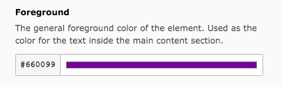
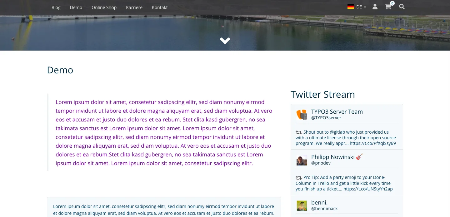
Foreground – Text
The text is placed on the main background. For good legibility, the text must have sufficient contrast to the background.
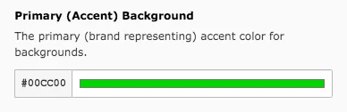
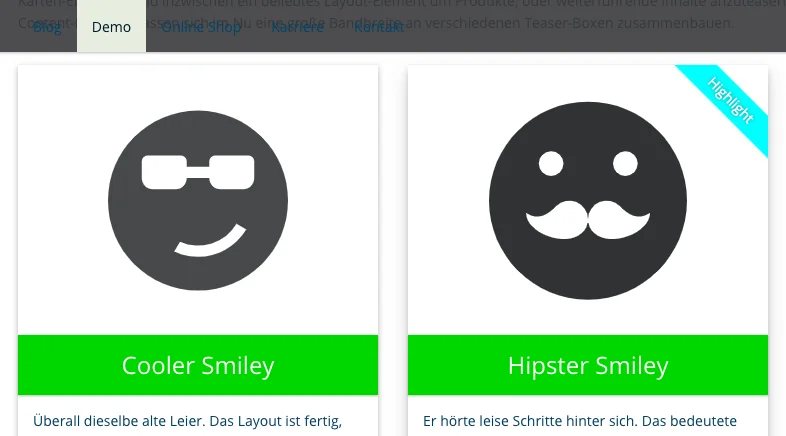
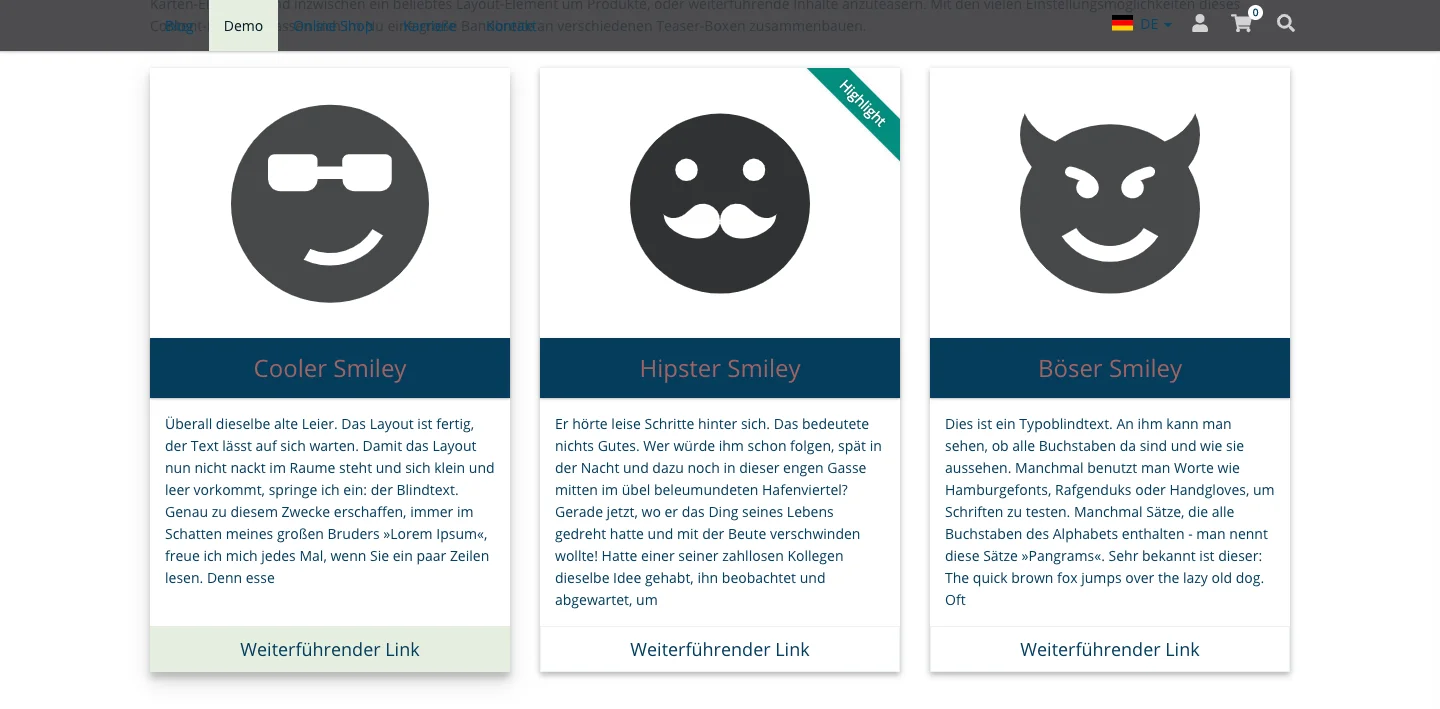
Primary (Accent) Background
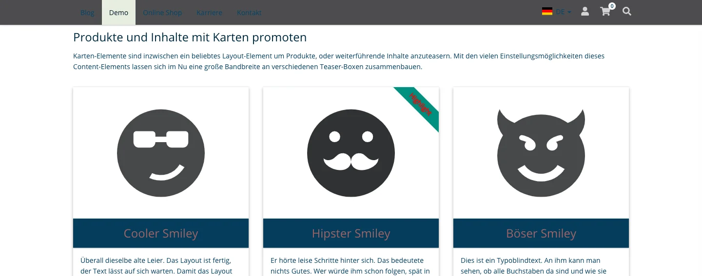
Some content elements have titles or lines that are highlighted, such as cards. You can set the background color here. For such elements to be effective, it is important that they contrast with the main background. In the simplest case, you set the main text color here and then choose the text color as the main background color. So you invert the colors.
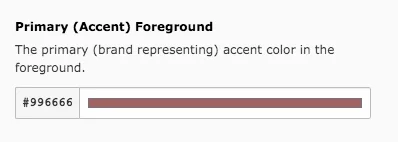
Primary (Accent) Foreground – Text
Select a color for the primary accent foreground, i.e. the text that represents the primary (accent) background above the marker.
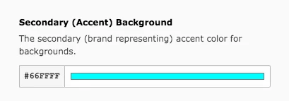
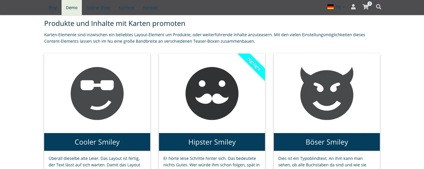
Secondary (Accent) Background
You also determine the brand-representing background color for accent elements, such as a badge.
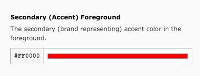
Secondary (Accent) Foreground – Text over secondary (accent) background
The color of the text of such elements can also be set.
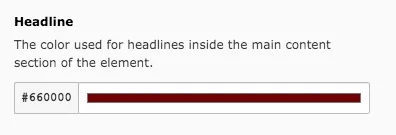
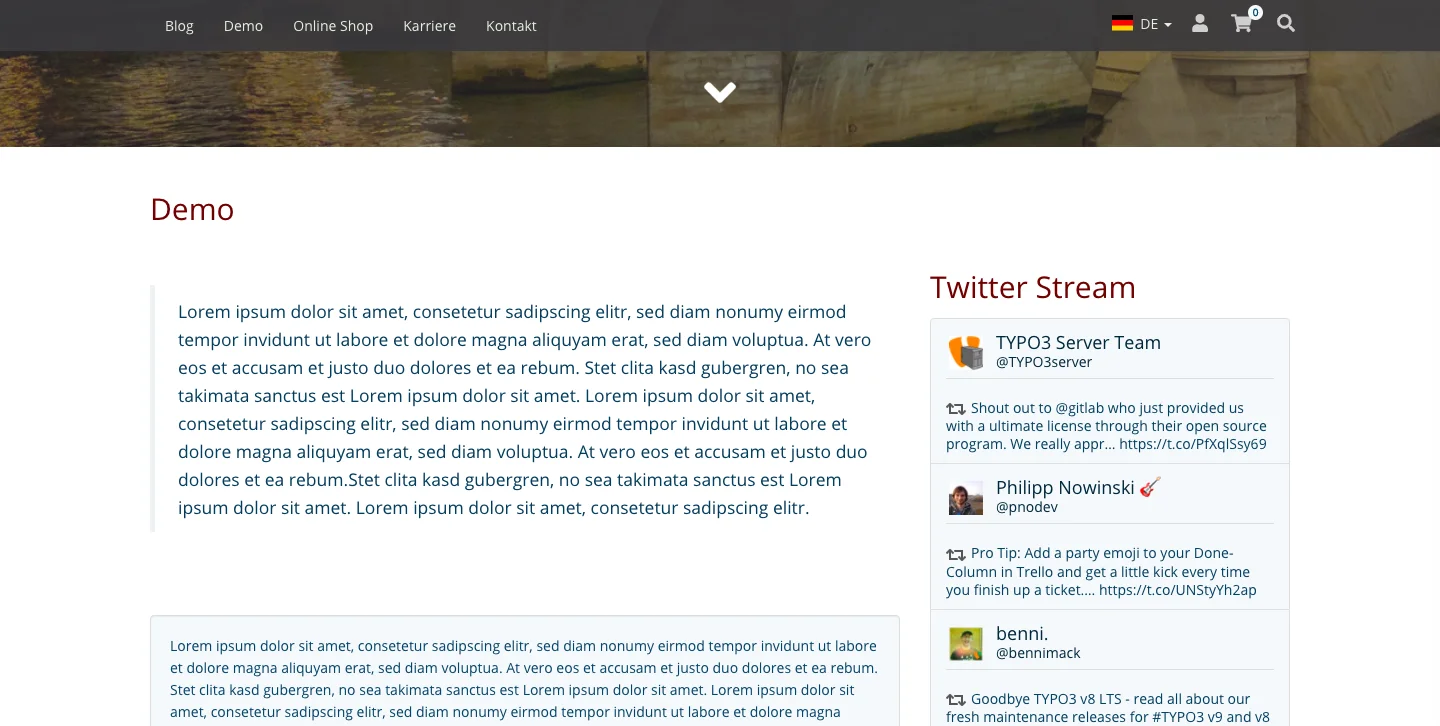
Headline
The headline color is selected separately from the text here.
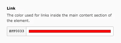
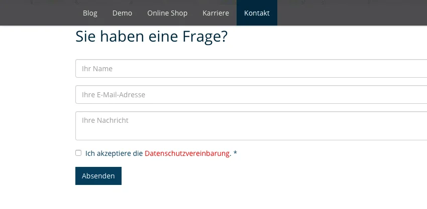
Link
Links are often displayed in a different color than the rest of the text for easier recognition. You can set the color of your links here.
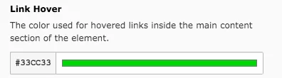
Link Hover & Link Background (Hover)
Links can (additionally) be marked with the mouse-over effect. To do this, set these two colors.

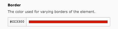
Border
Specify the border color here, e.g. for quotations.
Logo
The page logo will appear in the upper left corner above the menu. The favicon can be seen in the tab bar of your browser and in the bookmarks to the left of the page name. It must be 16x16 pixels in size.
Basic Colors
Body Color is the color of the HTML body behind the content. This color is only visible at higher resolutions.
Content Area Colors
Select the color set for the content area in the frontend. Box Shadow Color is the color of the box shadows in the entire page content.
For best results choose a dark colour.
Top Bar Colors
Select a color set for the Top Bar. The Top Bar is the line containing the logo.
Navigation Colors
Color Set
This is the color to be used for the navigation/menu bar, except for the background color. The latter is defined in the next field.
Background Color
Here, you define the background color that is used for the navigation/menu bar.

Background Opacity
The navigation bar is always visible, no matter how far a user scrolls down. The bar overlaps contents that are located in the upper part of the page. In order to separate the navigation bar from the contents, a transparency can be set here. Valid values are in the range 0.0 - 1.0, the lower the value, the higher the transparency.
Megamenu Colors
Color Set
This is the color to be used for the mega menu, except for the background color. The background color of the mega menu is set in the next field.
Background Color
Select a background color for the mega menu here.
Background Opacity
Since the navigation bar is always visible, the mega menu can also be opened at any time so that it appears above the content. At this point you can decide on the degree of transparency or leave the mega menu non-transparent. Valid values are in the range 0.0 - 1.0. The lower the value, the higher the transparency. A value of 1.0 means that the mega menu is not transparent.
Responsive Side Menu Colors
Select the color set to be used for the menu in the mobile view. For a uniform image of the website it should not differ too much from the colors of the navigation bar.
Area Colors
Dark Color Set
Select the color set that is to apply to all dark areas and the footer.
Light Color Set
Specify the color set for light areas, job detail pages and breadcrumb navigation. The latter is the link bar above the content that shows the user where he/she is hierarchically located on a page.
Component Colors
Color Set
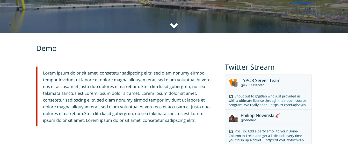
Here you decide on the colors of most components, e.g. cards, teasers, tabs, accordions or the Twitter stream.
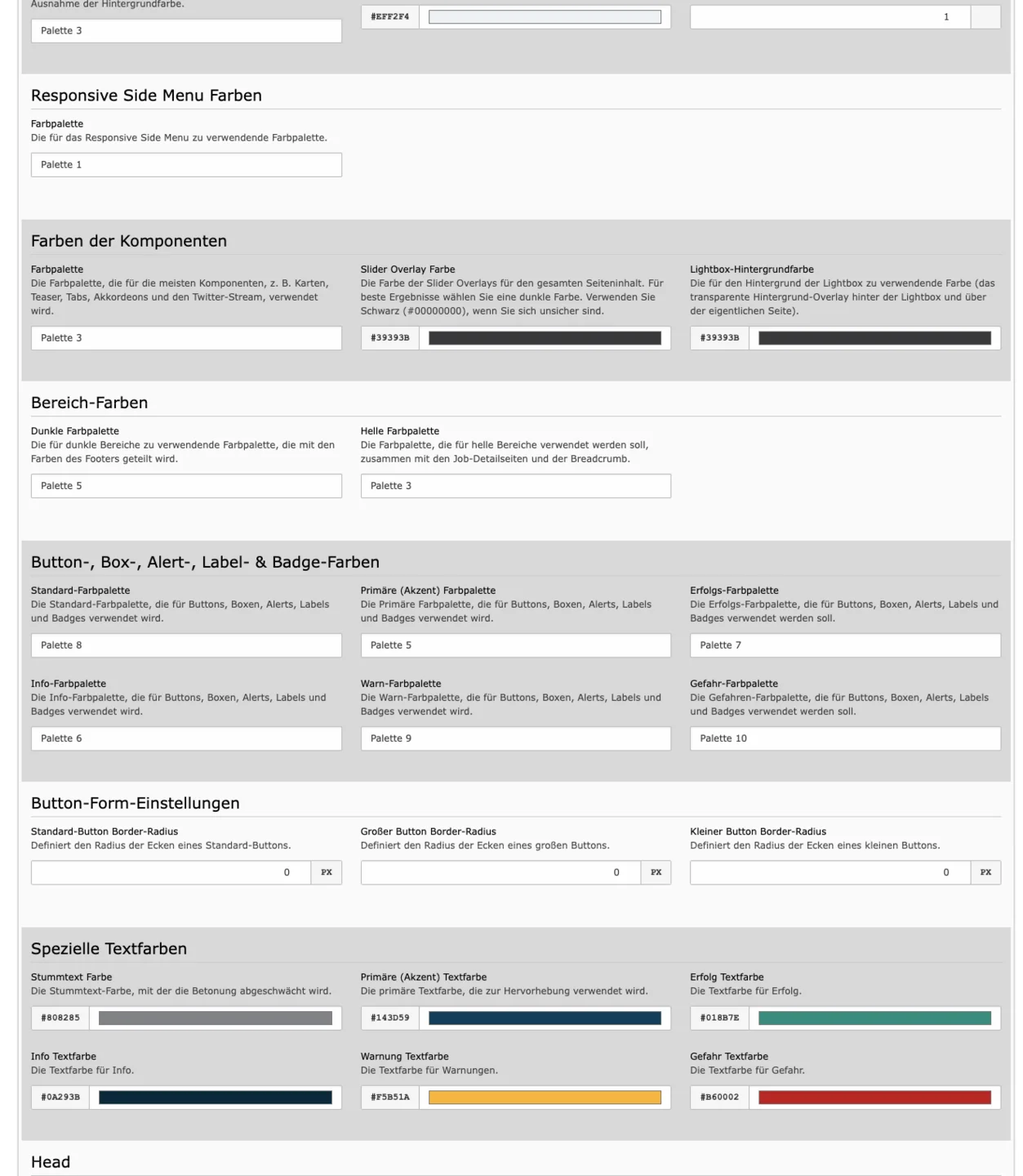
Slider Overlay Color
Sliders can be created with an overlay, i.e. a transparent color that is placed over the slider. For best results, choose a dark color. Use black (#00000000) if you are not sure.
Lightbox Backdrop Color
The lightbox is a way of presenting images, which is a standard feature of our website base. When you click on an image, it is enlarged and displayed in the middle of the page, while the rest of the page is darkened/covered. You can choose the colour of the cover here.
Button, Box, Alert, Label and Badge Colors
The Website-Base allows to display content in a variety of ways, e.g. boxes, buttons, labels and similar are used. Again and again you will also encounter the settings: Default, Primary, Success, Info, Warning, Danger. In this context, it is worthwhile to adjust several color sets, because the buttons and boxes can only differ in color if a different set is selected for each. In the Color Set, the background color and the text color (Foreground) determine these elements.
Button Shape Settings
Define the radius of the corners of small, large and standard buttons. The higher the number, the more rounded are the corners of the buttons.
Special Text Colors
In the Rich Text Editor (RTE), you can set other colors for the text than the color set by default. There are six colors to choose from: Muted, Primary, Success, Info, Warning, Danger - you specify which colors are used in each case. Click on the color field and simply select or enter the desired color from the color palette that appears.
Head
Here, it is possible to enter an individual HTML code for the head. Among other things, the head contains metadata and information on the presentation of the page, but is not displayed in the frontend, i.e. the website.
Font Sources
All fonts that you want to use on the website must be defined here. You can either specify a font name or insert a link to a hosted font file (as shown in the screenshot). If you want to use multiple fonts (e.g. to differentiate between text and headline), you must insert multiple links/names here.
Fonts
Copy Font
Select the font to be used for normal text.
Headline Font
Select the font to be used for headings.
Font Sizing
Base Font size
Enter the font size for normal text.
H1, H2, H3, H4, H5, H6 Font size
Determine how large the respective headings should be.

Sizing
Default Element Distance
Enter how large the distance between content elements should be.
Vertical inner distance
Define the vertical inner spacing for base size elements. This applies to buttons, for example, which are changed in height as a result.
Horizontal inner distance
Define the horizontal inner spacing for base sized elements. This applies for example to buttons, which are changed in width as a result.
Vertical inner distance [lg], [sm], [xs] & Horizontal inner distance [lg], [sm], [xs]
Define the vertical and horizontal inner distance for large [lg], small [sm] and extra small [xs] elements.
Basics – Page Title
The page title you enter here will always be appended to the title of the subpage in the browser tab, e.g. Demo - Website-Base.
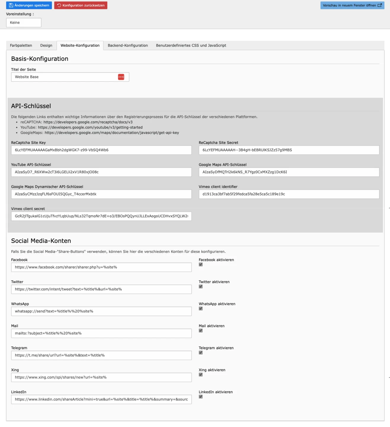
API Keys
APIs are interfaces for applications, e.g. on a website. The API Key provides authorized access to the tools - you need it especially for Google applications like ReCaptcha, Vimeo or Google Maps.
Social Media Accounts
If you want to allow users to share content via social media, you can configure this here. You can activate Facebook, X (formerly Twitter), WhatsApp, Mail, Telegram, Xing & LinkedIn.
In this tab you customize the backend of your page.
Basics
Specify the e-mail address and name that you want the system to use by default for sending e-mail.
Backend Login
Customize here the page for logging into the backend. Upload your logo and a background image of your choice and define a highlight color.

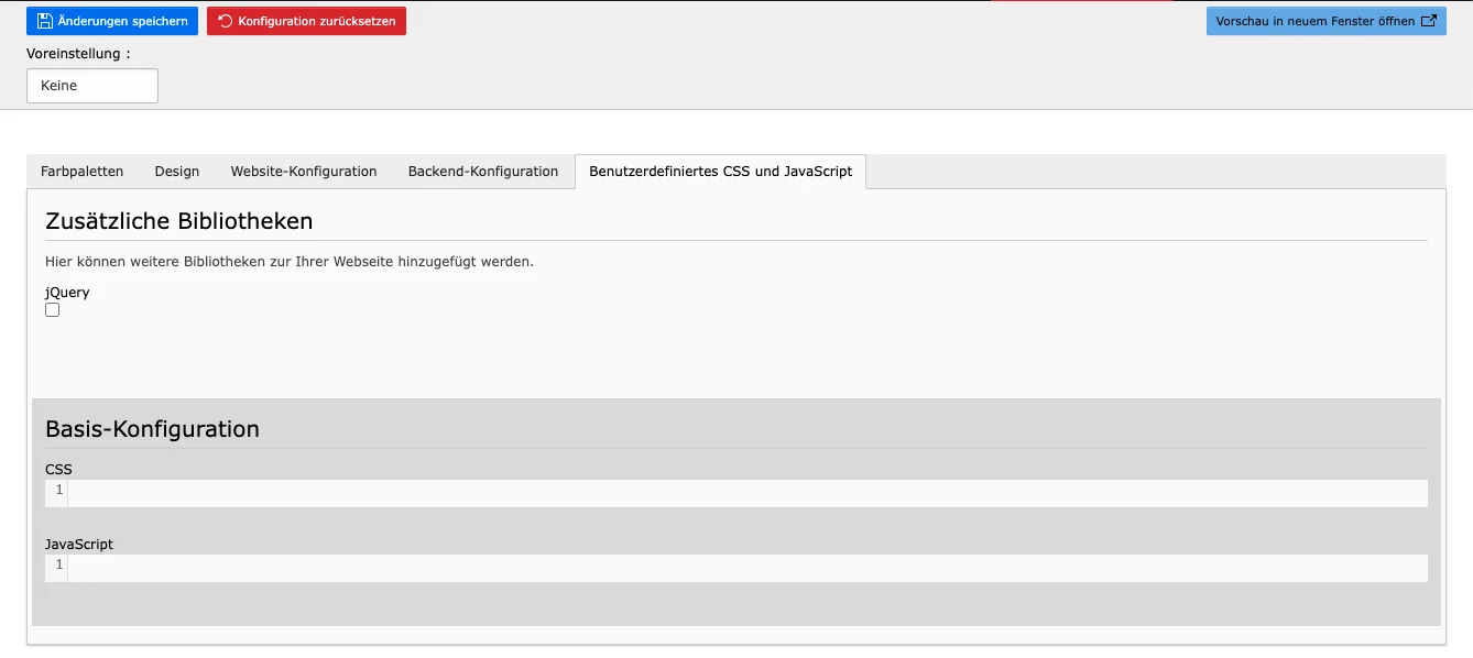
Create custom CSS stylesheets and JavaScript in this tab.
Would you like to know more?
All information about the available editions can be found on the webpage for our TYPO3 Website-Base. You have the possibility to get a Website at a Fixed Price or you decide for a Website as a Service package, with which no further costs for hosting or security and function updates will come up to you.
