
NEW: SG AI – YOUR AI ASSISTANT FOR TYPO3 – SEO, (IMAGE-) TEXT, IMAGES & MORE!
Mask Elements
Mask is an extension for TYPO3, with which you can easily create your own content elements without having to be a developer. This is because Mask allows you to compile the required fields for the new content element simply using drag & drop. The TYPO3 extension also makes it possible to extend page properties with desired fields in this way. Mask generates a fluid template for each created content element, which can also be customized.
In this documentation, however, we will only introduce you to the content elements and their functionality that are available in Website-Base. The Mask Elements contain useful content elements that can be used to easily integrate special content and quickly implement special display forms.
The Testimonial Mask element makes it easy to highlight quotes. Use the element to present customer testimonials in an appealing way, for example. Click Create new in the content element to create a new quote and add the text and author. In addition, you can also attach an image that appears to the right of the citation in the frontend. You can place as many citations as you want in a content element.
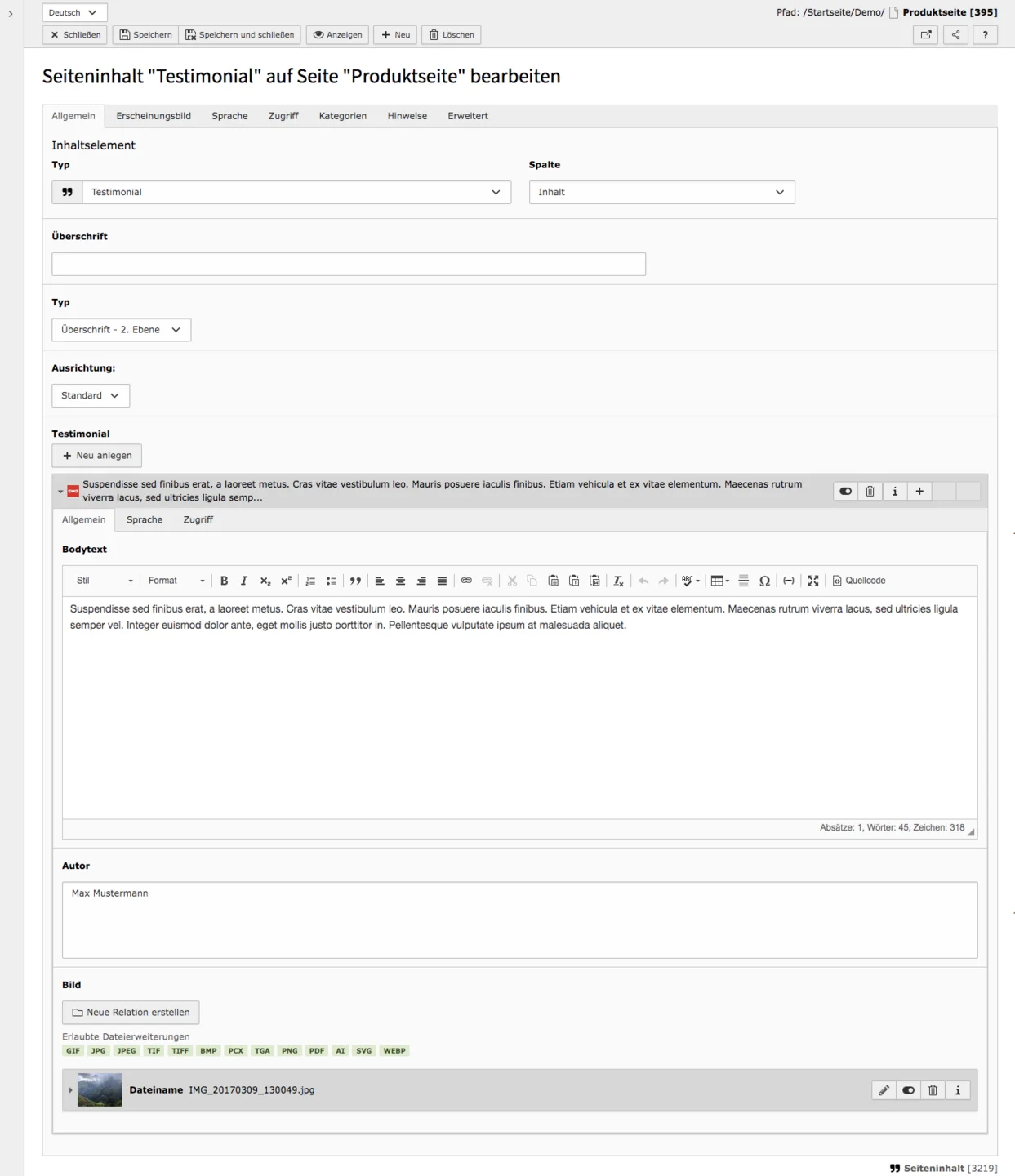
Testimonial in the frontend
And this is how the content element with an image looks like in the frontend. You can also see it on our preview page.


With a Highlight Box you can display important information on your website in a special way. In contrast to areas, highlight boxes can only be filled with text. However, they can be inserted into grids. The symbol you see here will be encountered when creating a highlight box as well as in the content area.
Tab General
When editing highlight boxes, you must primarily edit the General tab. All other tabs are adjusted only in exceptional cases.
Type & Column
In the Type field you can see in which content element you are currently located. The Column tells you where the element is placed.
Header, Type, Type (visual), Alignment
Under Header you enter a title for the content element and define the layout of the heading in the Type field below. In addition, you can define a different visual heading level, as well as the alignment of the heading.
Text
In the Rich Text Editor you enter your text as usual.
Background Style
Five different styles are available for the background. The colours in brackets correspond to the standard design of the website base: Primary (dark blue), Success (cyan), Info (grey), Warning (yellow), Danger (red).

Highlight Boxes in Frontend


The mask element FAQ / Accordion displays simple text content as an accordion or as a FAQ element for questions and answers. The latter generates structured data that Google can use to better display the search results of the page. With a simple accordion, content can be displayed in a clearly ordered manner By the way, almost all content, whether text or images, can be accommodated in the Grid element Accordion.
The Mask Element FAQ / Accordion is an easily configurable content element that allows content to be displayed quickly and easily in a clear manner. To create the accordion you only need to fill in the fields in the General tab.
Tab General
Create and Embed Structured FAQ Data from these Elements
If you check this box, a FAQ element will be generated, otherwise an accordion will be formed.
Expanded by default
The accordion elements are normally collapsed in the frontend and can be expanded when clicked. This checkbox can be used to specify that the current elements are always expanded.
Questions-Header Type
Each element in the accordion has a question or header. Specify here which header level each question in this accordion element should have.
Elements
An element corresponds to an accordion line or a question and the corresponding answer. Click on Create new under Elements to add a new 'line'. In contrast to the grid element accordion, all 'rows' are located in one content element and can only be edited there.
Question / Header
The field for question / header corresponds to the title of the article or the question of the FAQ element. It can be seen before the element is expanded. In the frontend click in the field where the header name appears to expand or collapse the article.
Non-Collapsible Preview
Here you can enter a small preview text that can be seen without having to unfold the element. This text is not included in the structured data.
Answer / Content
In this field, enter the answer or content in the Rich Text Editor.
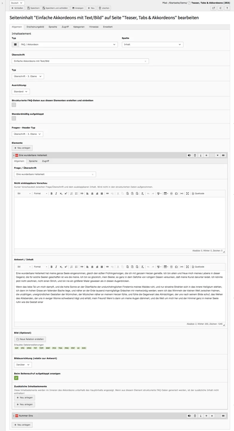
Image & Image alignment
You can also assign an image to the article. To add an image, simply click on Create new relation and select an image from the file list. You can also set the image alignment.
Show expanded when page is loaded
Normally all articles are collapsed when a page opens. If you want to display an article unfolded when the page is loaded, set a check mark at this point.
Additional Content Elements
It is possible to insert further content elements under the main content. These will not include the structured data.
Media adjustments
Here you can set the height and/or width for all media of the FAQ / accordion content element.
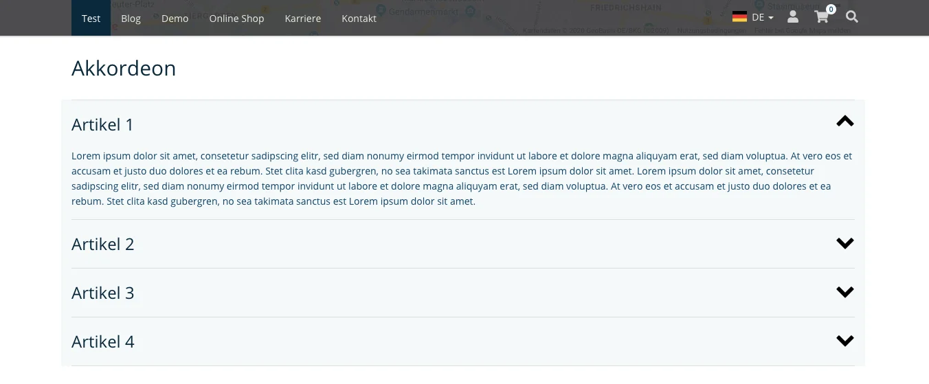
Accordion in Frontend
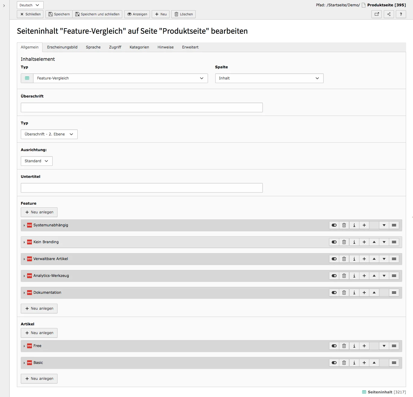
The content element for the feature comparison allows you to compare up to four products in terms of their features and price in a table. It does not matter how many features are compared with each other. With this element, the advantages of certain products can be presented without much effort and in a clear manner.
Tab General
Header, Type, Type (visual), Align und Subheader
If you specify a header, it will appear directly above the table. Specify the title with type (header level), which may differ from the visual header level (the actual header level seen in the frontend). Also specify the alignment of the heading. The subtitle will appear under the title.
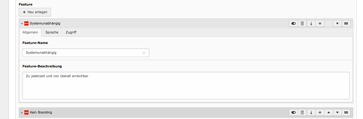
Feature
To create features use the Create new button and fill in the feature name. Optional is a feature description, where you can specify more detailed information about the feature. If a feature is already created, you can create features both above and below the created element. It is also possible to move features to a desired location at any time.
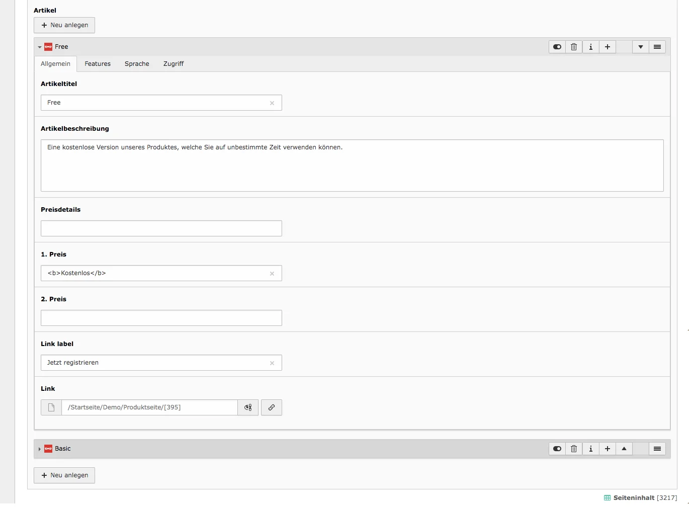
Item
For the item, you can set the name, description, prices and a link in the General tab. The name is at the top of the table and directly below it are the other item details.
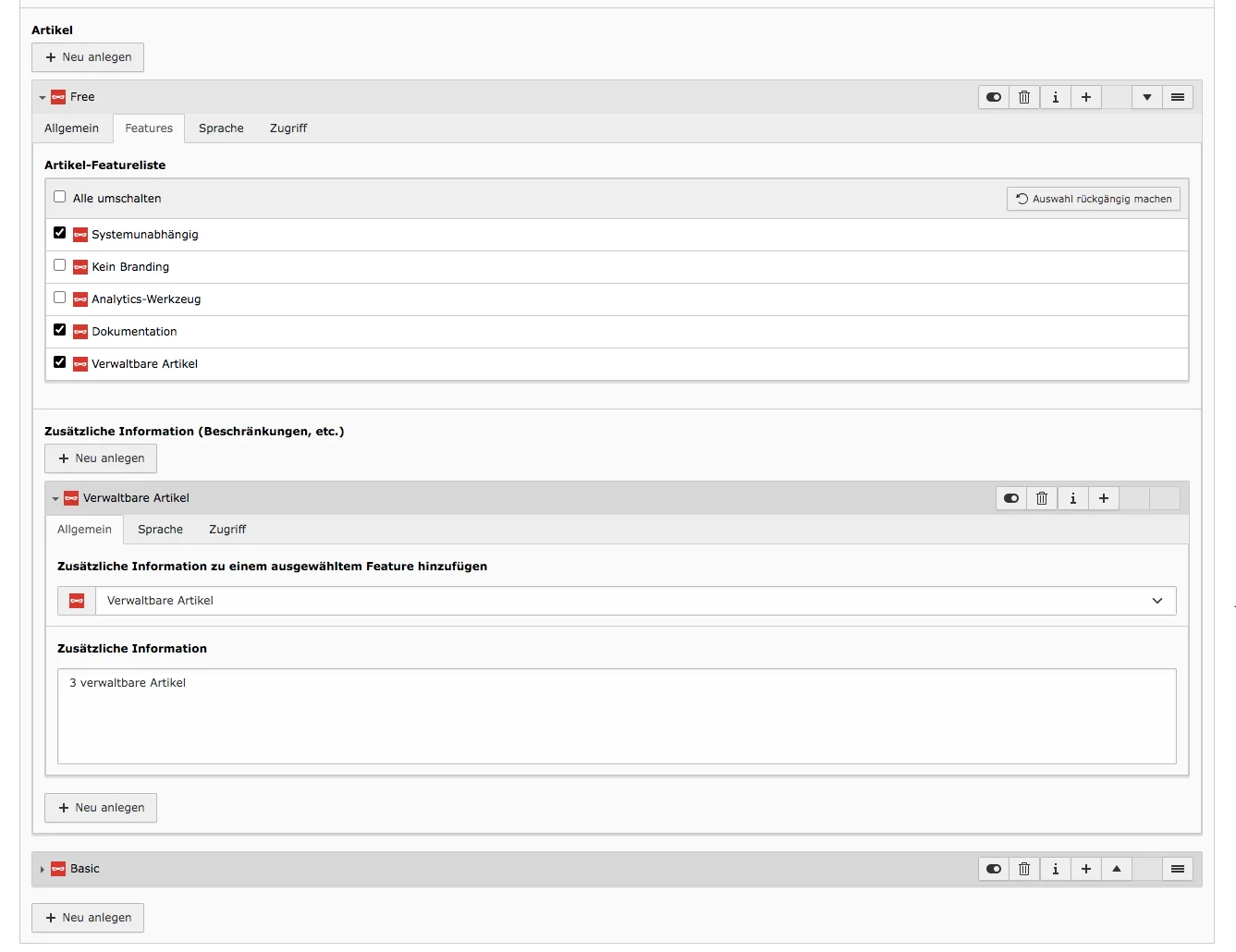
In the Features tab there is a list of all features where you can select which features the article contains. Should a feature require more information for this article, you can specify this under additional information. In order for the additional information to be shown in the frontend, the feature must be activated in the corresponding item.
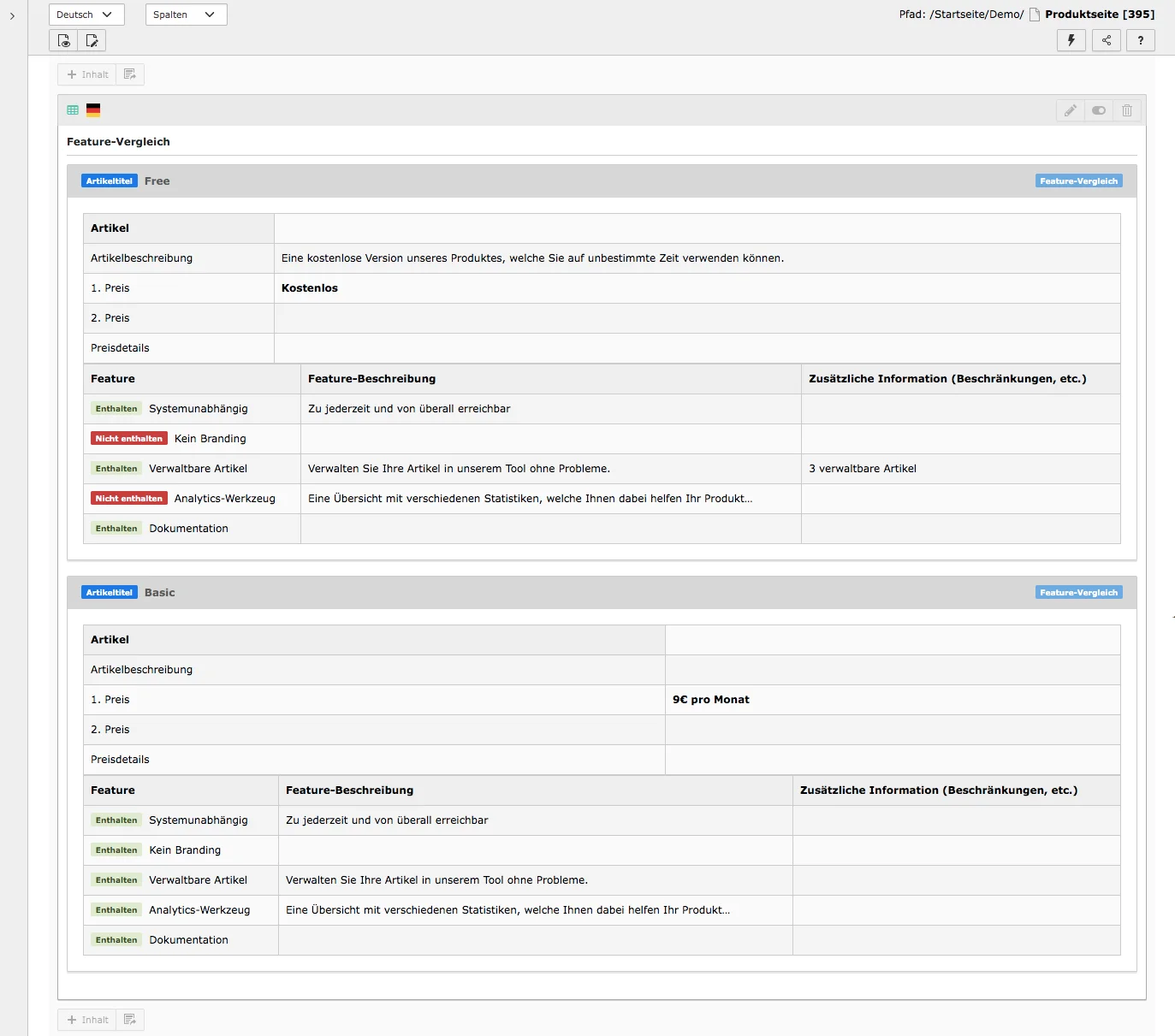
Feature Comparison in the frontend
You can check out the feature comparison element on our preview page.
The popup/banner element allows you to quickly and easily add a popup component or banner to any page for important information. The content, width of the window and the triggers can be configured and adjusted at any time.
Tab General
In the General tab you define the content or the appearance and further behavior of the popup.
Upper Content & Content
The upper content is, so to speak, the title line above the content. In the case of the banner, which appears directly below the menu at the top, it is the content on the left that, as with the pop-up, differs in color from the other content and is thus particularly highlighted.
The content is located below or, in the case of the banner, to the right of it. Both can be any content element. You can add a content element using the Create new button and change the content element as needed in the drop-down menu under Type.
Multiple elements can be created for both the upper content and the content.
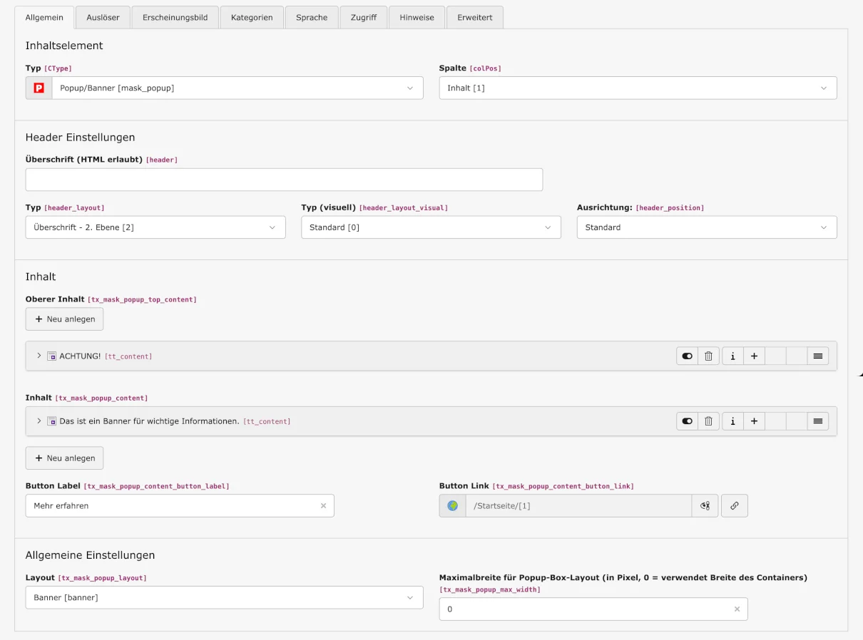
Button Label & Button Link
If you want to add a button to the content, do so here.
General settings
Layout
Select here whether you want to use the pop-up or banner layout.
Maximum width for pop-up box layout
If you are using the pop-up, you can set the width here.
Tab Triggers
This tab determines when the pop-up should appear and disappear:
- Exit intent: Pop-up appears when attempting or intending to leave the page.
- Content links act as close buttons: Clicking on a link closes the pop-up.
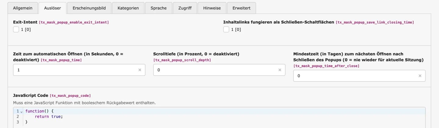
- Time to open automatically: After opening the page, x seconds will pass before the pop-up appears.
- Scroll depth: Specify that the pop-up should appear after 50% of the page length, for example.
- Minimum time (in days) until the pop-up reappears after closing: Specify when the banner should reappear after closing. If the value is 0, the pop-up will reappear in the next session.
JavaScript
The JavaScript code does not need to be customized and should only be customized by people with the appropriate technical expertise.
Backend Preview
The two contents can be edited in the popup element as well as individually accessed via the content area to edit them separately. The preview for the banner in the backend differs from the popup layout, but the content can also be controlled individually for the banner.
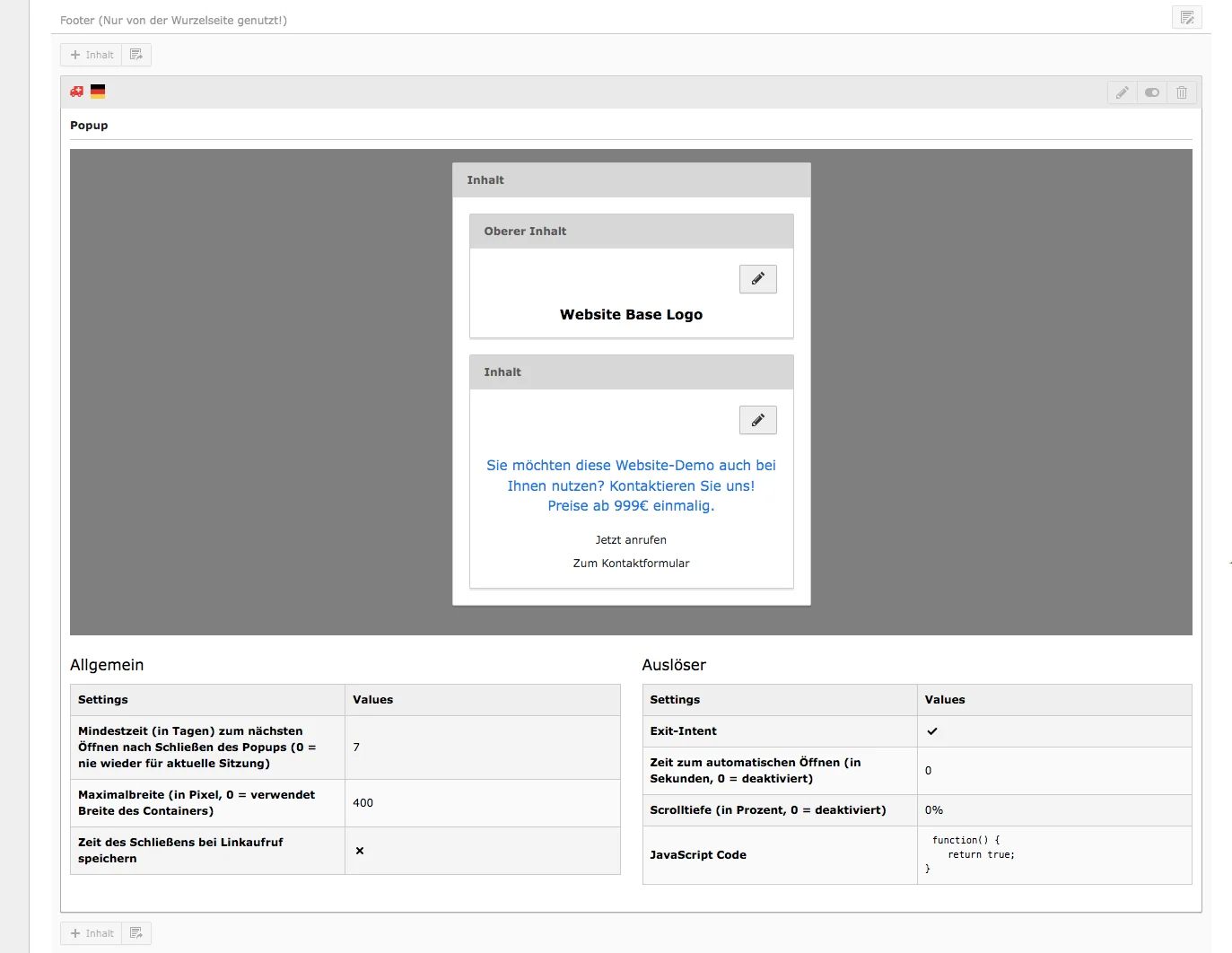
Popup in the frontend
On the home page of our Base website, you can see the pop-up element with exit intent and, on another demo page, the (alert) banner.

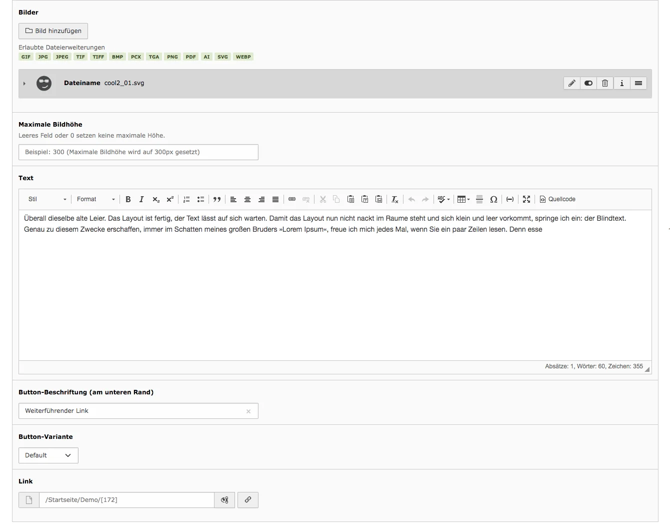
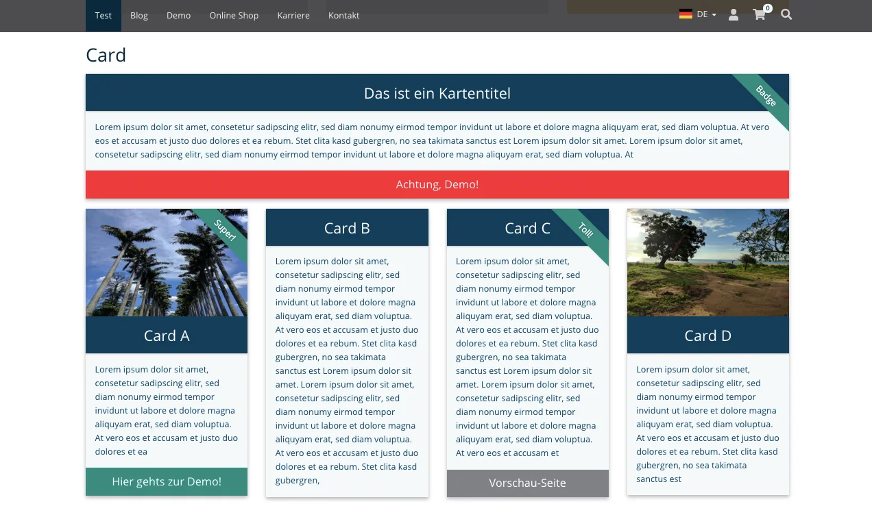
The content element Card makes it easy to distinguish products or important information from other content. With a wide range of options for designing the cards, you can easily create the perfect design. The symbol that is shown here identifies the Mask Element Card when creating and editing the content element as well as in the content area.
Tab General
Header, Type, Type (visual), Alignment
Enter a title under Header and define the heading level in the Type field below. Under Type (visual), you can set the heading layout that will actually be displayed in the frontend. Finally, specify the alignment of the heading.
Card title
The card title appears at the top of the map, as you can see in the screenshot below The title is 'connected' to the map, while the Header appears above the map.
Badge
With a badge you mark a content or a product as special. You should therefore only use this field if you want to highlight a product or information.
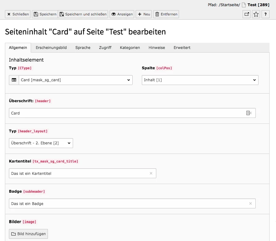
Images
The image appears above the map title and text. If you insert a badge, it will be 'stretched' over the upper right corner of the image.
Maximum image height
Set the maximum image height in pixels. Enter a desired value for this. If there should be no maximum height, enter nothing or the value '0'.
Text
Enter the content or article into the Rich Text Editor.
Button Label
The button appears at the bottom of the card. You can use it to link to a product page or an external page.
Button type
Seven different colors can be set for buttons. In the Design Configurator the colours can be adjusted, but by default the following colours are available: Default (gray), Primary (dark blue), Info (light gray), Success (turquoise), Warning (yellow), Danger (red), Simple Link (colorless background / a simple link).
Link
Click the link icon under Link. Select an internal page in the window that appears or enter an external URL and link the button at the bottom of the map. (Without a link you basically don't need to insert a button label).
The figure below shows how different maps can look like. For more card variations just visit our preview page.
Cards in Frontend

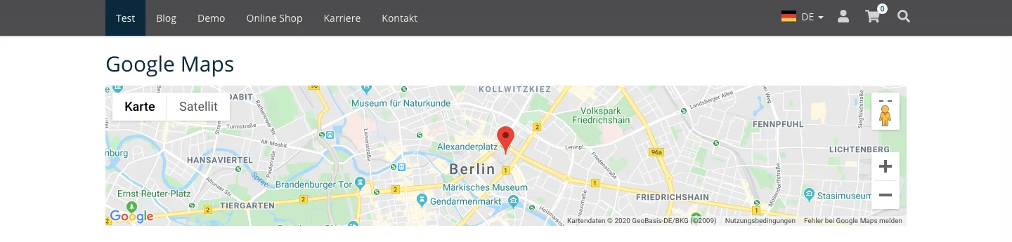
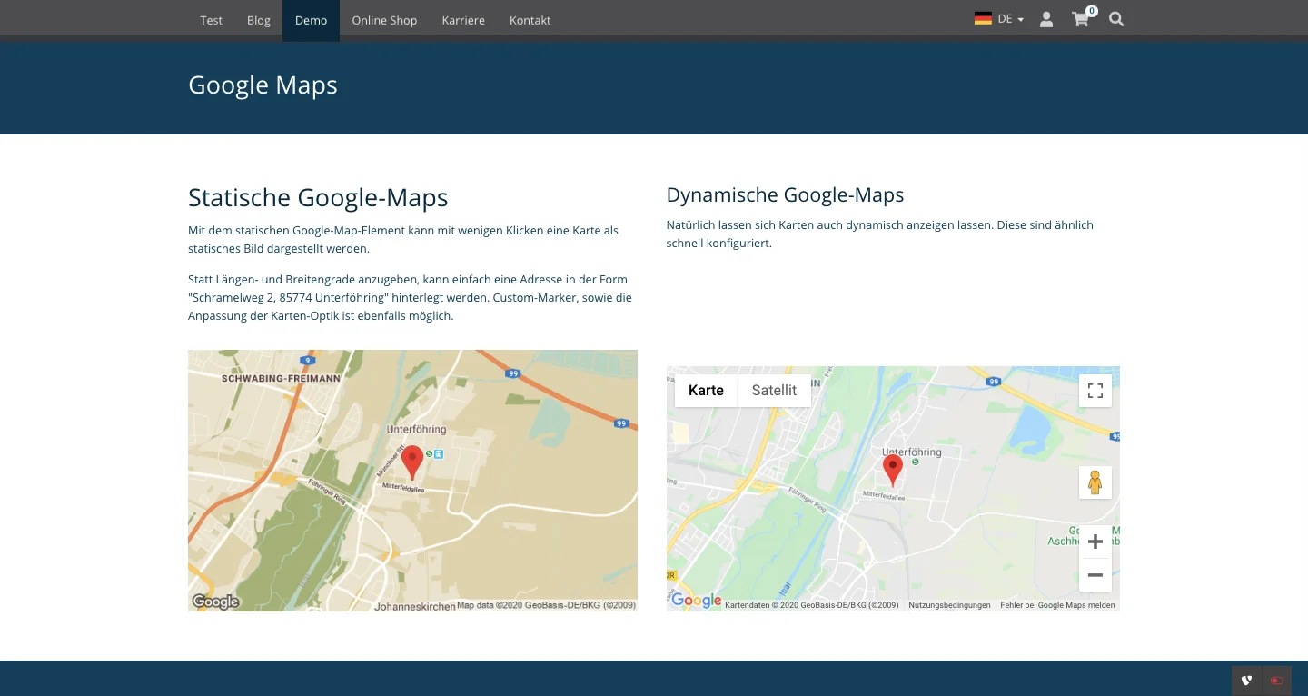
The content element Google Maps allows you to integrate a dynamic map in just a few steps. The user can move the map, zoom in and out, view it in full-screen mode or in Street View. Whether a marker is set or a description is inserted can be set individually.
Tab General
Type, Column & Header
The Type field shows you in which content element you are currently working. The Column field indicates where the content element is located. You enter the Header in the free field and specify the layout of the title in the Type field below.
Latitude, Longitude & Address
The coordinates or the address you enter here are displayed in the middle of the map (however, there is no marker for the exact location yet).
Zoom Level, Width & Height
You can determine how much the map should be displayed enlarged or reduced by using the zoom function. The default setting is 13. The screenshot below shows how this level looks in the frontend. With the width and height you can set the size of the area around the specified address or coordinates. The specifications can be made in pixels or percent. The default setting is 100 % width and 200 px height. In a 2-column map the map would take 100 % of the width of a column.
Show controls
By default, the controls are not activated for the user. If you want your site visitors to see the buttons for zoom in and zoom out as well as for Google Street View, you must check this box.

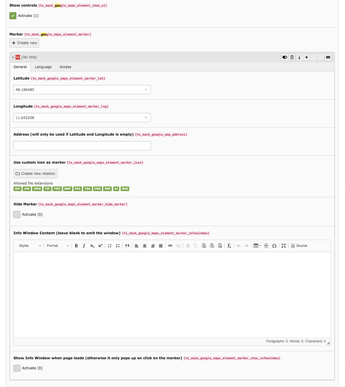
Marker
You use markers to label a location. You can also define several markers on a map, for example to show main and outbuildings or to point out prominent houses in the area for better orientation.
To create or edit a marker, proceed as follows:
- Under Marker, click Create new.
- Enter the coordinate or latitude and longitude or the address.
- The address also serves as the name of the marker. If you enter latitude and longitude, you can use the address field to name the marker.
- Upload a custom icon for the marker and link it by clicking on Create new relation.
- By default, Google uses a red marker, as shown in the screenshot.
- To make a marker no longer visible in the frontend, simply activate the checkbox under Hide marker. When you remove the check mark, the marker will be visible again.
- With this option, unused markers do not need to be deleted and can be used again at any time.
- Enter information about the set location into the text editor and specify whether the text appears when the page is loaded or only when the marker is clicked. With a check mark at Activate, the info box will appear without a click.
Google Maps in Frontend
Here you can see a screenshot of a map with controls, a marker and the width of 100 % and a height of 200 px.

With the Static Map you create an image of a map. An image as a map is good for the performance of your site, because no large amount of data needs to be loaded. However, a simple screenshot can cause legal problems. Therefore, there is the possibility to insert a static map. This can also be adapted to your own design.
API Key
Before you can embed a static map in a page, you need a Google Account. With this account you can get an API Key (API = Application Programming Interface). This allows Google to track how often the map was loaded on a page. Above a certain number of map views, the service becomes chargeable, which is why you always have to provide Google with your credit card data for the key. However, since you can limit daily use, you can also avoid possible costs.
To obtain an API Key, proceed as follows:
- Log in to Google with your personal login data.
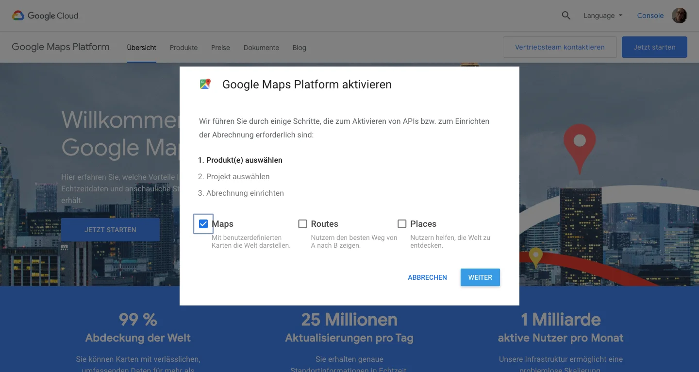
- Then go to the Google Maps platform: https://mapsplatform.google.com/
- Click on Get Started.
- In the window that appears, select Maps and click Next.
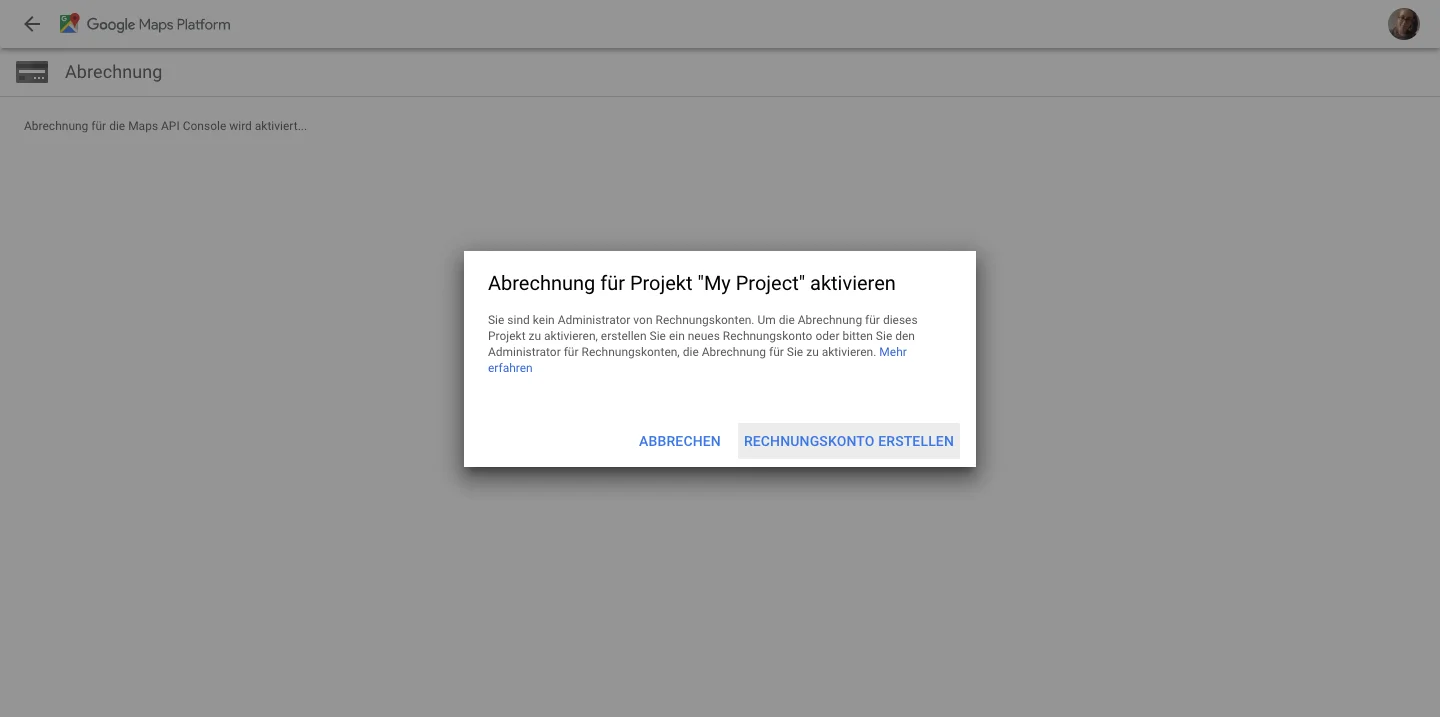
Select an existing project or create a new project. Click Next.

If you have not yet created a Google billing account, you will need to create one here.
- Then go to the Google Cloud Platform Console: https://console.cloud.google.com
- Select a project and click on Credentials.
- Select Create Credentials and click API Key from the drop-down menu. Click Create.
- Your created key appears in a new window. Close the window.
- You should save the API key before using it. Follow the instructions on the Google page: https://cloud.google.com/docs/authentication/api-keys?hl=de#api_key_restrictions
Tab General
Type, Column & Header
In the first field Type you can see which content type you are currently editing. The Column field shows where the content is located. You enter the Header in the free field and define the layout of the title in the Type field below.
Address of the map center
Enter the address that should be located in the middle of the map here. Follow the example given in the content element.
Width, Height & Zoom level
Specify how wide and how high the map should be on your page. Note that the maximum width and height of the map is 640 px. Larger maps can only be used by Google Premium customers. As with the dynamic Google map, the zoom is set to 13 by default. You can see how the zoom level works on our Preview Page.
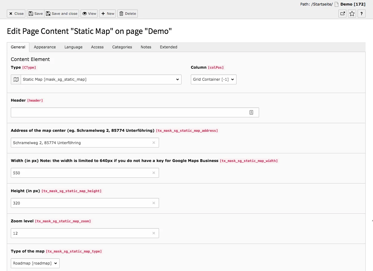
Type of the map
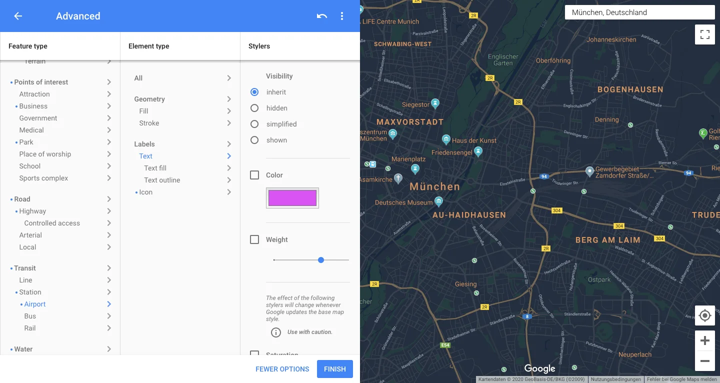
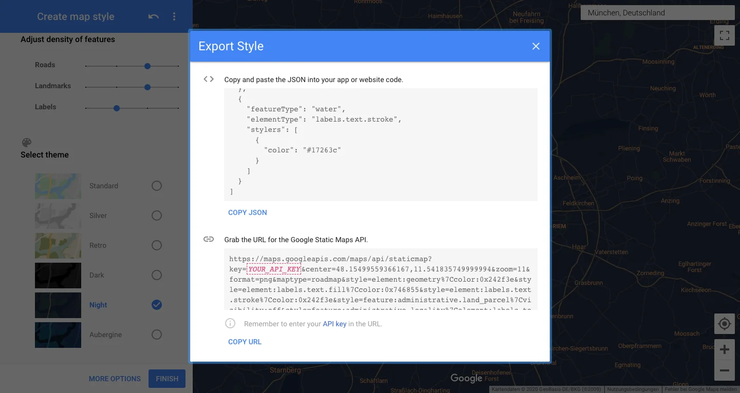
Four options are available for the card type: Roadmap, Satellite, Terrain & Hybrid. Only if you select Roadmap can you use the Styling field, which allows you to customize the generated image of the map according to your wishes.
Styling
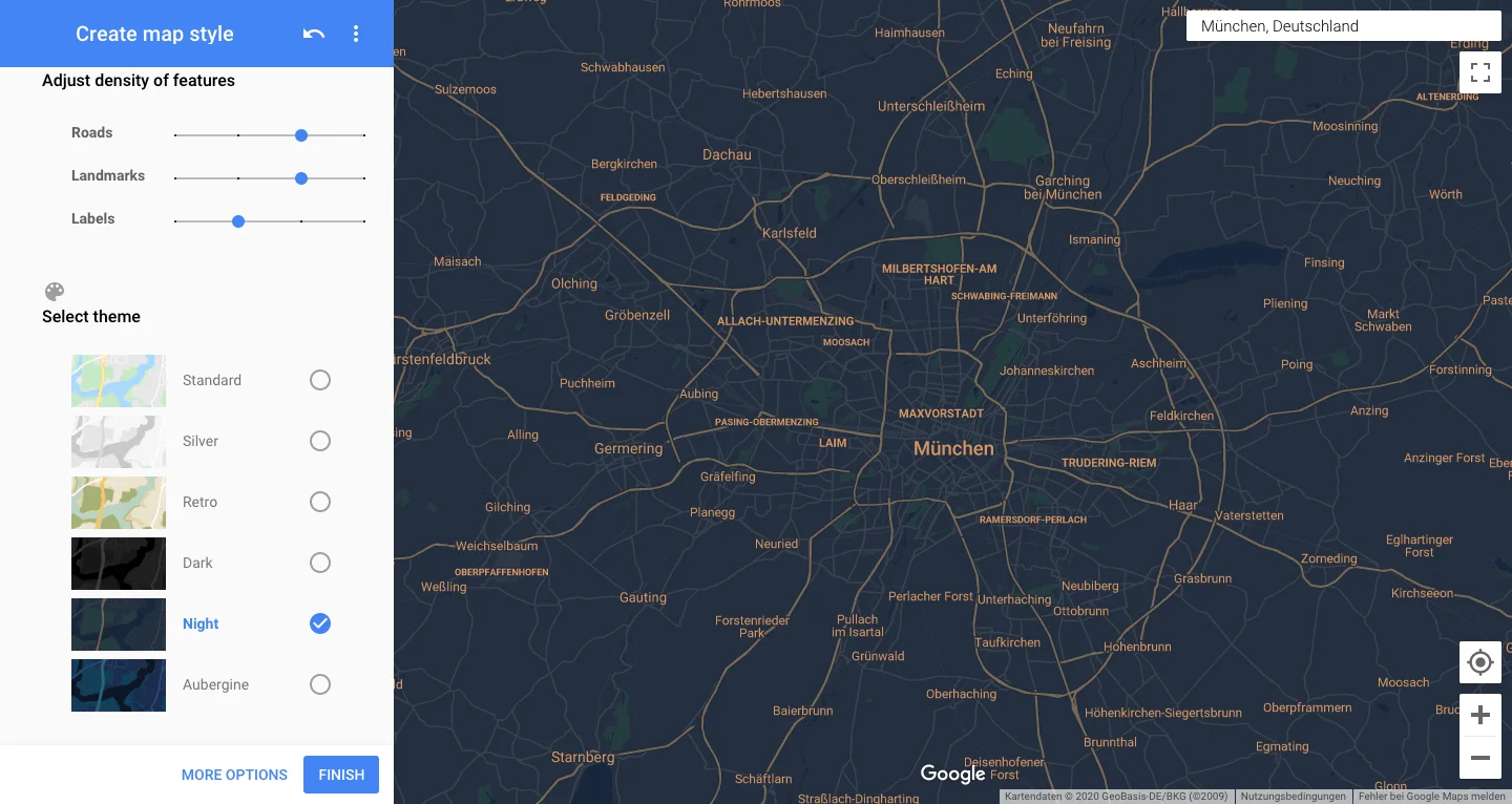
In the field Styling you enter a JSON file, which you can generate on the following page: https://mapstyle.withgoogle.com. Select at the top how dense roads and markers should be displayed. Next, select a layout. At this point you could already have the file created. To further customize the map, click on More Options. The map can be color-coded to match your corporate design. When you go to Finish, a new dialog box appears from which you have to copy the JSON file to insert it into the TYPO3 content element.
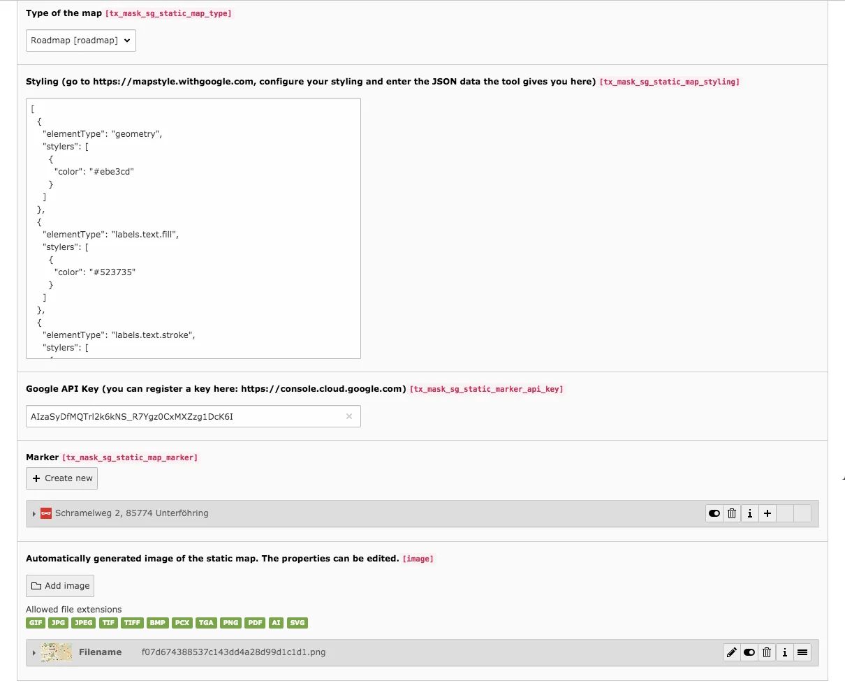
Marker
To set a Marker, click Create New and enter the address to which the marker should point. You also have the option of using your own icon instead of the standard marker. To do this, upload an icon in the filelist and create new relation within the marker.

Static Map in Frontend (left)
The download element allows to create a list of files for a download including optional descriptions for each file. The type of the files is not important. Instead of a file you can also add a link to the download list. All added files will be opened in a new browser tab in the frontend when you click on them.
Tab General
Type & Column
In the field Type you can change the type of the content element and under Column you can see in which column the content is located in the content area.
Files
For each entry in the download list you have to add one file with Create new. After adding an image/file, the fields for image metadata and image manipulation are available.
Link
Instead of a file from the file list it is possible to insert a link. This link is only used if no file has been added.
Description
The description is used as a list entry in the frontend. Otherwise the file name or the URL is used.
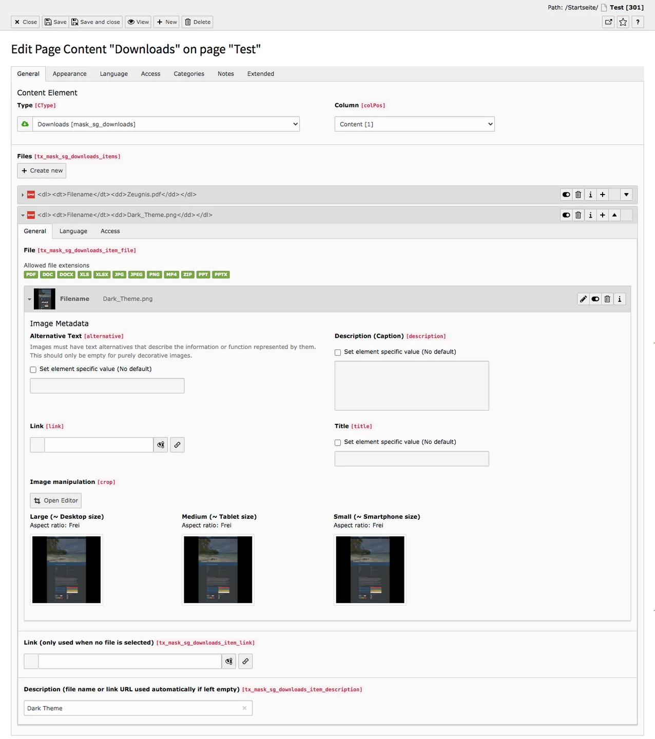
Downloads in Frontend


The Mask Element Image Gallery allows you to display many images at once in a gallery. A gallery can be configured very quickly, as only a few steps are required in the General tab to achieve the result you see below in the frontend. At the same time, the element also allows you to create a gallery slider; there is a tab with carousel settings for this purpose.
Tab General
Images folder & Images
To add images to the gallery, there is the possibility to select an entire image folder from the file list or to select individual images. To add a folder to the content item, click the link icon under Images Folder and choose the desired folder in the file list. To add individual pictures, under Images, click Create new relation and select the images you wish to add. You can also use both options (Images folder & Images) at the same time.
Width of each image & Height of each image
By default the height and width of the thumbnails in the gallery are set to 128 px. You can customize this by simply entering the appropriate numbers here. As a result, you will get tiles in the frontend similar to those shown below.
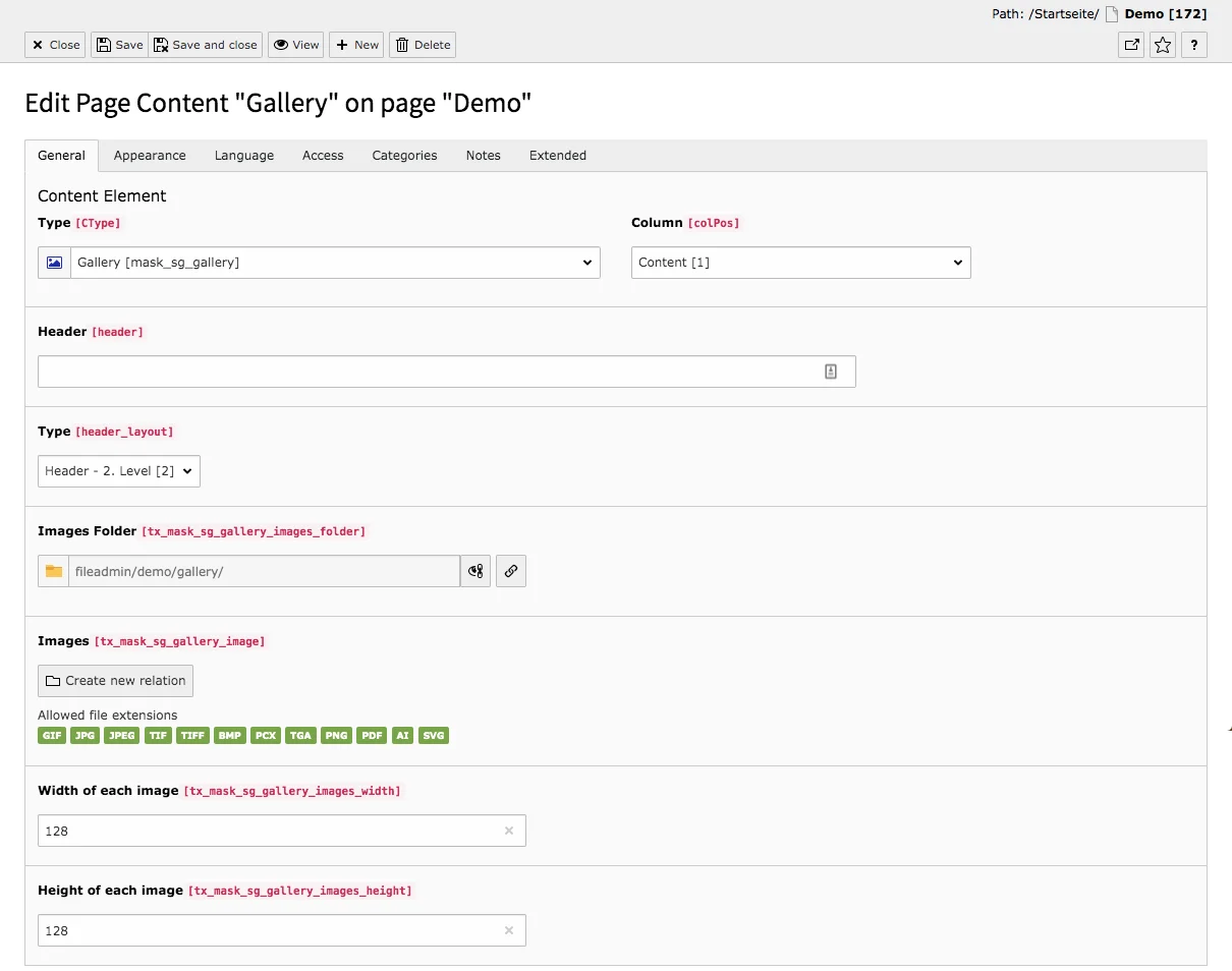
Image Gallery in Frontend
Our preview page on the Base website shows what the image gallery can look like in the frontend.

Tab Carousel settings
Carousel layout
This checkbox activates the carousel or image slider.
Images with lightbox, Hide arrows, Hide indicators
Specify whether images can be opened in a lightbox, whether users should be able to move between images using arrows, and whether indicators (dots below the images that show whether the first or xth image is currently being displayed) should be shown.
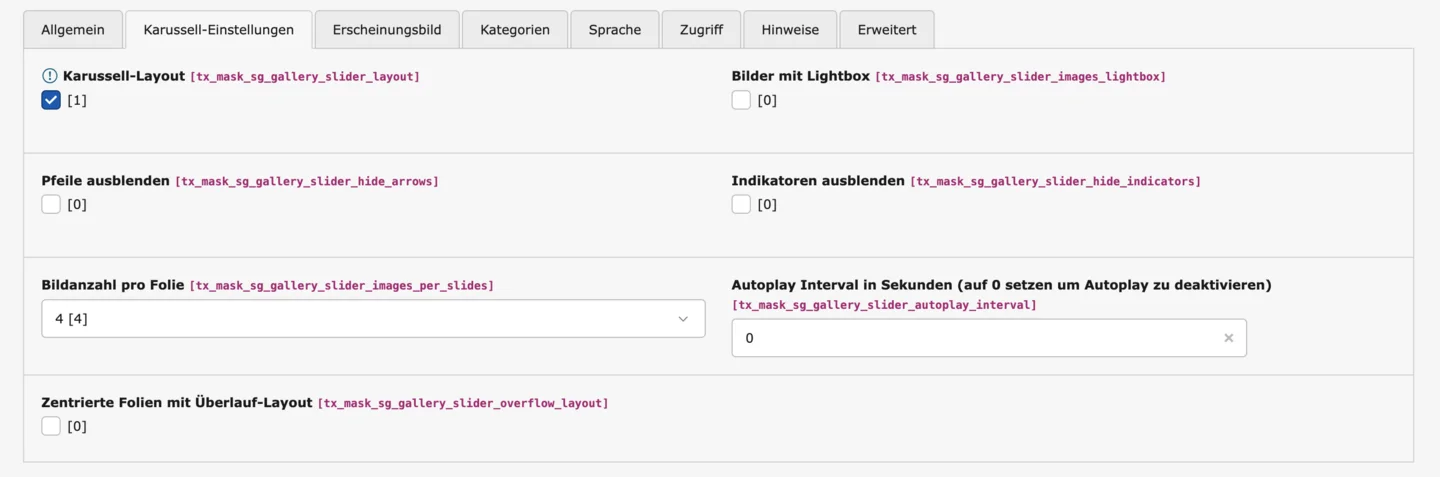
Number of images per slide, autoplay interval in seconds, centered slides with overflow layout
Specify how many images should be displayed per slide. If you want the image slider to move automatically, determine the interval at which this should happen. Finally, you can set the images to be centered, while the outer images are “cropped” in the overflow layout.
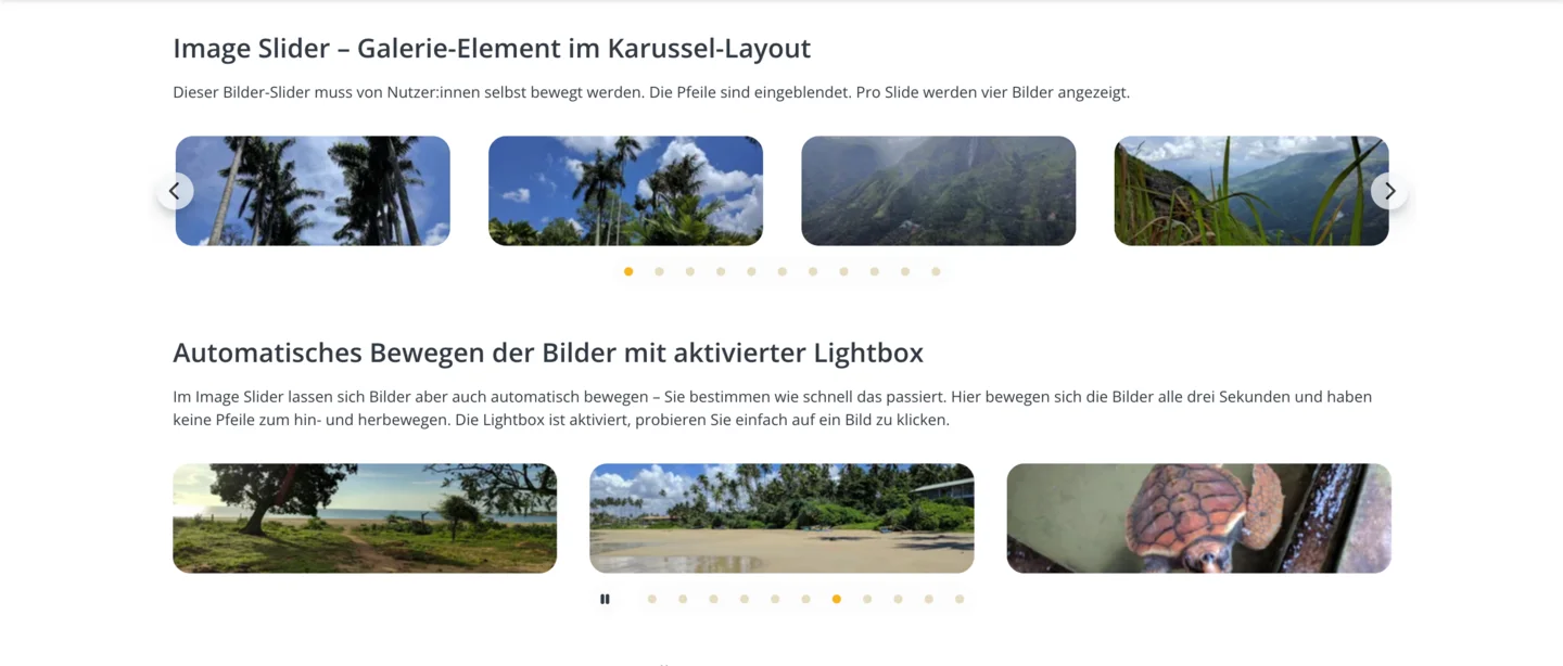
Image gallery slider in the frontend
The carousel format differs significantly from the normal gallery. On our preview page, we show the various options for displaying the image slider.
The mask element Products allows you to display your offered items clearly and visually appealing in cards. Up to four products can be placed in a row with the element. Selected products can be highlighted with a badge.
Tab General
To create a product, you simply use the Create new button. After that you just need to fill in the product information Product Title, Badge, Description, Features, Tems and CTAs. You don't necessarily have to use all the fields. For example, if the badge field is not needed, no badge will appear in the frontend if nothing is filled.
You can create up to four products, which then appear next to each other in the frontend. The position of the products can be changed using the arrows.


Products in the frontend
You can see the result in the frontend on our preview page.

Sliders are often used as headers of a web page. They are also suitable for image or product galleries or to present the portfolio of a company. A slider, like the other mask elements, is easy to configure. For a sliding slider you create at least two slides in the General tab. If you create only one slide, this will result in a static image over which you can place a text. The element also allows you to create peek carousels with the slides.
Tab General
General Settings
Autoplay Interval
In this field, you can specify how many seconds should elapse before the slide changes. The default setting is eight seconds. If you set the interval to zero seconds, the slides will not change automatically.
Maximum Height
In our website base, you can set the sliders to low, medium, or full screen, and leave the images uncropped (automatically).
Hide Arrows & Hide Indicators
If you create multiple slides, the navigation points (indicators) and arrows are normally activated so that users can move the slides themselves. If necessary, arrows and indicators can be hidden here.
Elements per slide
Set here how many media items should be displayed per slide.

You can select one to four media and set the settings differently depending on the output medium (mobile, tablet, desktop). For a simple slider (e.g., for headers or when the focus should remain on one element), one medium is often the best choice. Select more media per slide, especially if you want to use the peek carousel layout.
Peek carousel settings
Activate peek carousel
To use the layout, you must first activate it.
Enable peek for both sides (left and right)
This setting can only be used if at least 3 media per slide are displayed. If you enable this checkbox, the peek (part of an element that is partially visible – peeking in) will be visible on both sides – left and right. Without this setting, the peek will only be visible on the right.
Peek percentage
Here you can specify the percentage of the peek. You may need to experiment a little to achieve the desired look. Here, too, you can set different values depending on the output medium.
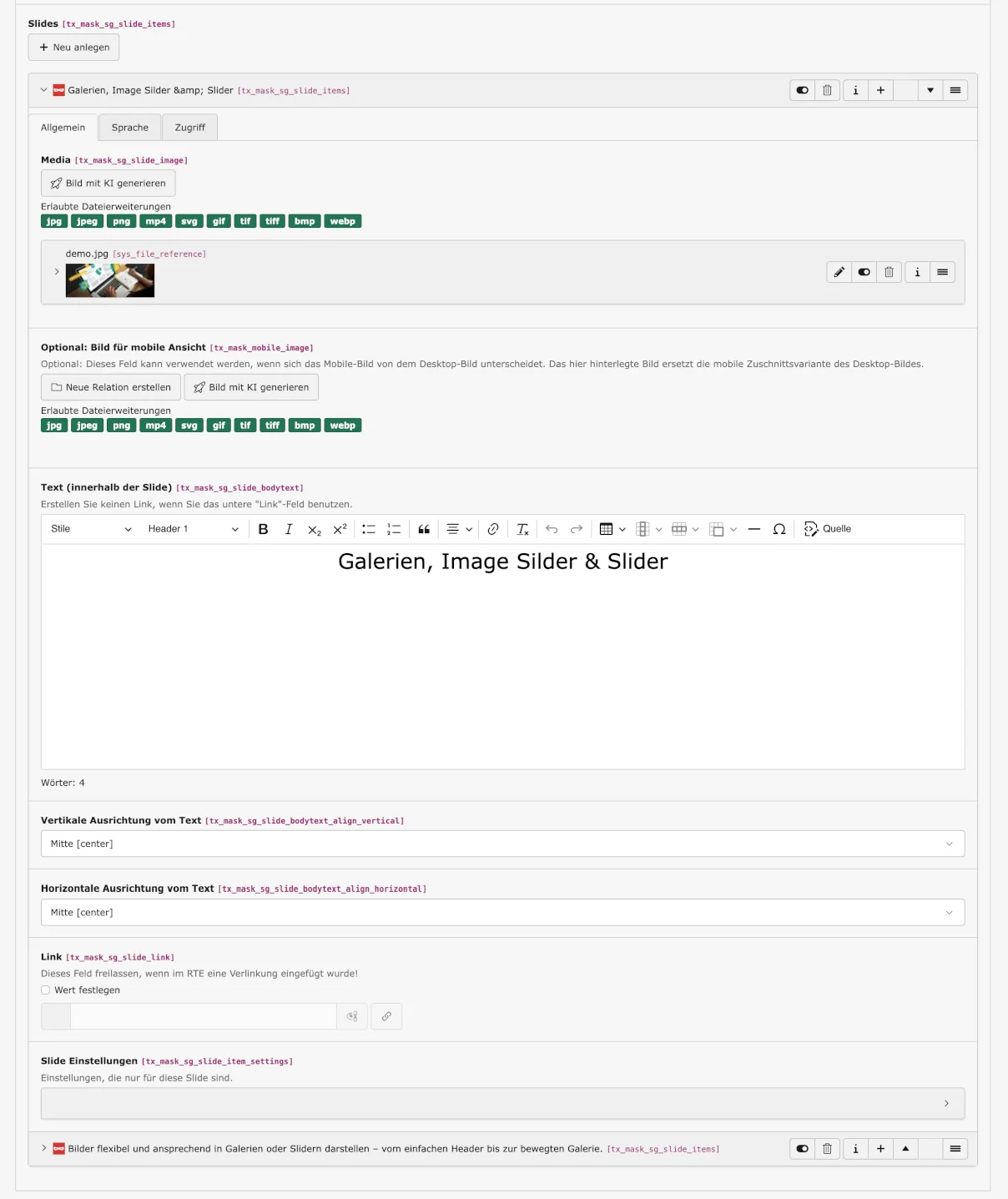
Slides
To add a new slide, simply click the button Create new and then configure the slide.
Media
The image, graphic, or video fills the slide. Only one media content is possible per slide. To add an image, simply go to the Create new relation button and select the desired content from the file list. For mobile optimization, it is also possible to use an alternative image for the mobile view.
Text, Vertical & horizontal alignment of the text
You can enter the text as usual in the RTE and use its full design options. Attention: If you insert a link here, you can no longer use the link option below. Below the text box, specify how the text should be aligned.
Link
You can link only the text on the slide, or link the whole image. For this, you need to set a link at this point. Simply click on the link icon and select an internal page or link an external URL in the window that appears. If you link the slide here, there should be no link in the text.
Slide settings
Here you can set a background, text shadow or box, or animation for the text if needed.
Slider in Frontend
You can view various formats of the slider live on our preview page of the Website Base.

With the Tab-Element you can display text content clearly and arranged in tabs. As with the accordion, you can use related information, which can be easily divided into categories/topics such as product information. The Simple Tab element can be created very quickly, because you only need to follow a few steps in the General tab to configure the content element.
Tab General
Content & Column
Under Type you can see which element type you are currently editing. The Column field shows where the content is located. You enter the
Header, Type, Type (visual), Alignment
Header in the free field and specify in the Type field below it which layout it should have. In the Type (visual) field, you can specify the layout of the heading regardless of the level and define the alignment in the field below.
Tabs
To add a new tab, simply click on the Create new button and fill in the fields for caption and content.
Tab Label
The tab label corresponds to the tab title within the content element Simple Tab-Element and is also displayed as a title in the frontend. The tab label is therefore always visible.
Tab Content
You add the tab content and edit it in the Rich Text Editor. The content is only visible in the frontend if the user has clicked on the relevant tab.
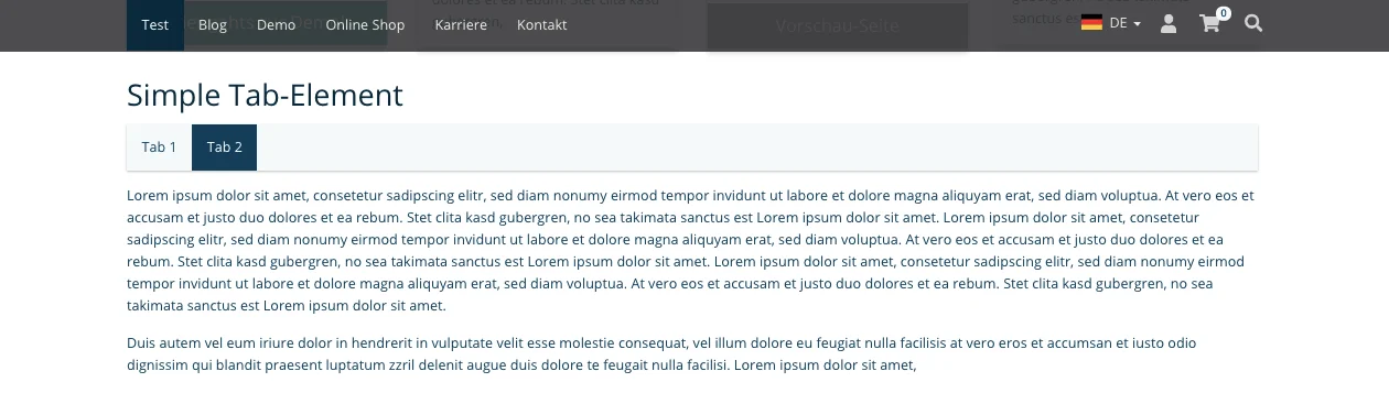
On your page, the Simple Tab element will look similar to the screenshot below. In our example there are only two tabs, you can of course create more, as shown on our preview page.
Simple Tab-Element in Frontend
The Image Map content element can be used to create interactive graphics with clickable markers. Scalable SVG files as well as PNG and JPEG images are supported. If an SVG file already contains markers, these can be specifically addressed in the backend—for example, to add labels or additional information. However, markers can also be created directly in the content element. The content element is not only suitable for classic maps, but also for interactive diagrams, construction and site plans, or organizational charts. The possible applications are therefore very diverse.
Tab General
Images
Here you can link PNG or JPEG images from the filelist.
SVG Image
Here, SVG files with or without markers can be linked to the content element.
Marker settings
First, general settings for the markers can be configured here. Below that, individual markers can be inserted and set. The default marker is a simple circle with a plus sign inside (or whatever has been set as the default in your instance), the size of which can be specified here.
Marker width
Determine the width of the marker.
Marker height
Determine the height of the marker.
Custom marker
If you want to replace the default icon with a different one, link the corresponding file to the content element here.
Markers
Popup box
If you want to label the marked point, you can specify a title here. You can add further information in the text box. You can also place a button in the pop-up box below the text, e.g. to link to other locations or provide a link to further information.
Coordinates
Here you can determine the position of the marker on the image. It can be a little tricky to set the correct position, but with a little practice it works quickly. If the positions do not have to be too precise, you can make the markers a little larger, for example, so that inaccuracies are less noticeable.

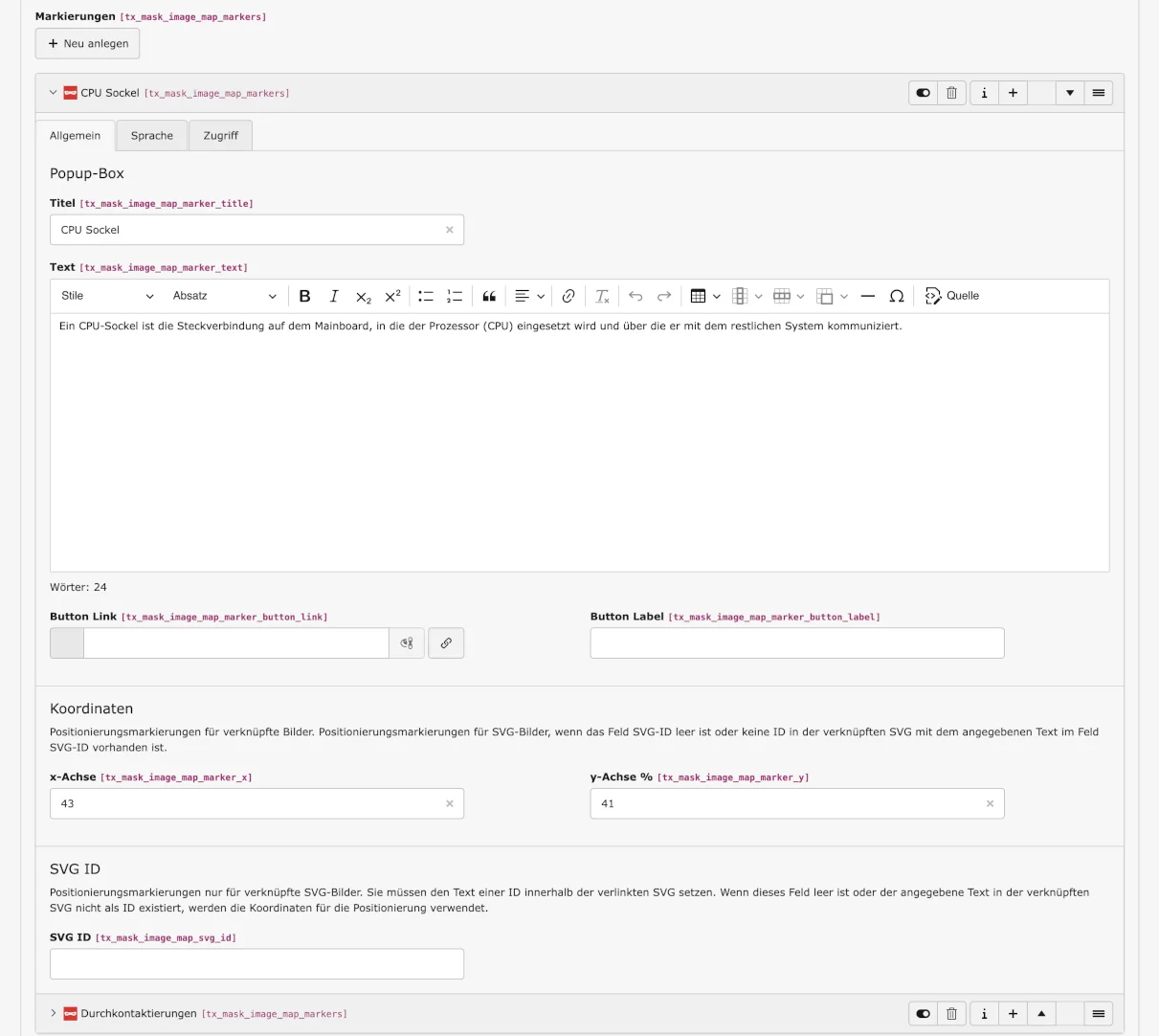
SVG ID
Enter the IDs of the markers in the SVG file used here. For this to work, the IDs must be entered correctly. If you do not want to change the position of the marker, leave the coordinates blank and only specify the title and, if necessary, text, button, and link.
Image maps in the front end
Take a look at our preview page Image Maps in the frontend. Only two examples are shown here – but the possibilities are numerous and varied.
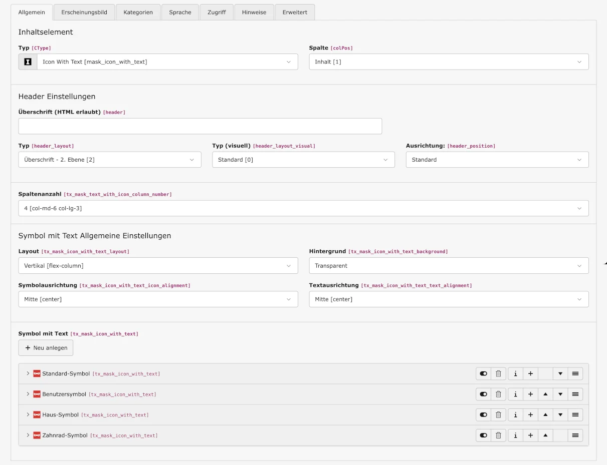
The Mask Element Icon with Text makes it easy to combine icons with text, for example to display a menu or link to further information.
Tab General
Number of columns
Select how many symbols should be displayed side by side in a row: 1 to 4 columns are possible.
Icon With Text general settings
Layout
Choose whether the icon and text should be aligned horizontally (icon and text side by side) or vertically (icon and text one below the other).
Background
Select the background – other options may be available in your instance – transparent, main color of your website, light, or dark.
Symbol alignment & Text alignment
Finally, decide whether you want to align the icon and text to the left, right, or center. The icon and text can be aligned differently if desired.
Icon With Text
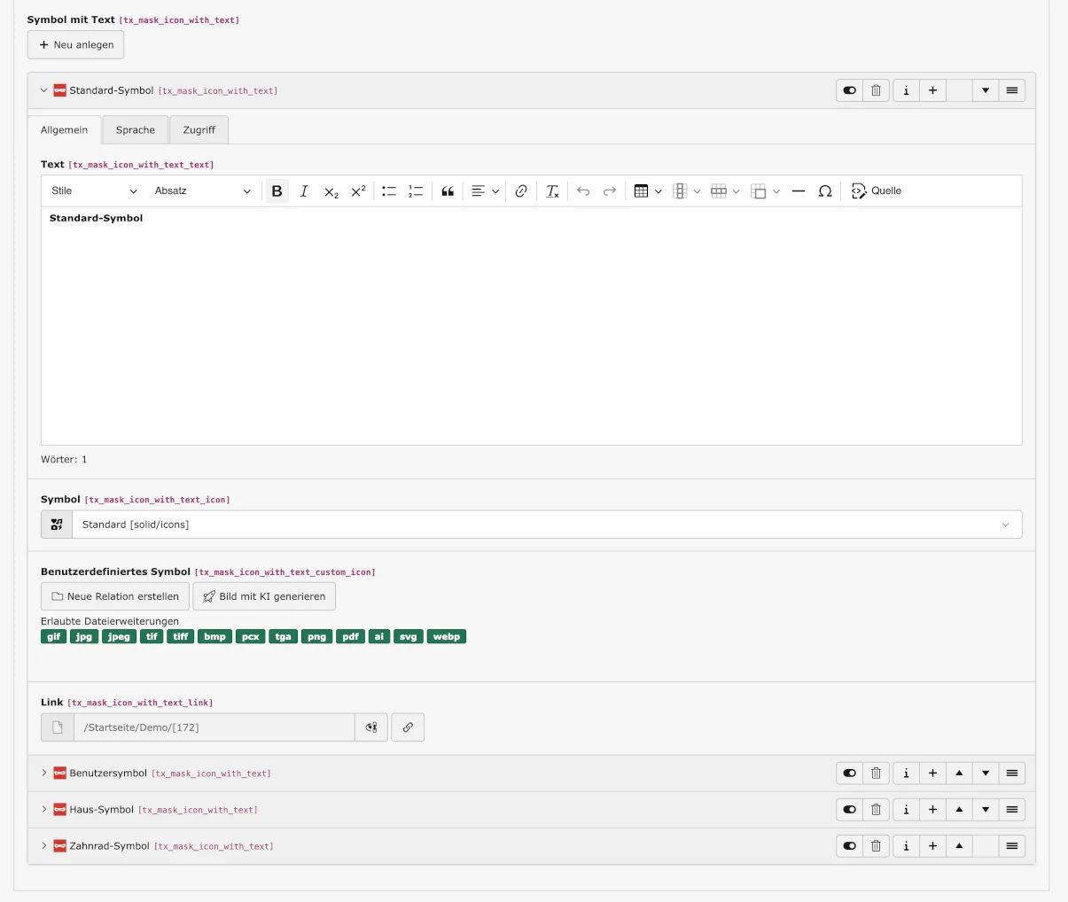
Text
Insert the text for the symbol here.
Icon & Custom Icon
Choose between a ‘Standard’ icon or link a custom icon that you have uploaded to the file list.
Link
Finally, link the icon to text if desired.
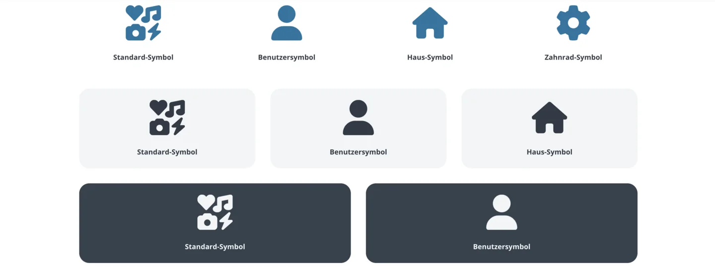
Icon With Text in frontend
You can see what the Mask Element looks like in the frontend in the screenshot below or on our preview page.
Would you like to know more?
All information about the available editions can be found on the webpage for our TYPO3 Website-Base. You have the possibility to get a Website at a Fixed Price or you decide for a Website as a Service package, with which no further costs for hosting or security and function updates will come up to you.
