


NEW: SG AI – YOUR AI ASSISTANT FOR TYPO3 – SEO, (IMAGE-) TEXT, IMAGES & MORE!
TYPO3 already has a wide range of content elements. With extensions, the spectrum of available elements is widened and enables the presentation and implementation of special content. Plugins are content elements from those extensions. Other content element groups, such as News or Account, also contain plugins, which we present separately.
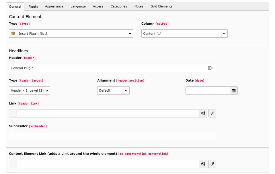
Tab General
This tab looks the same for all plugins. You can only define the heading of the element here. The tab contains the same fields as the content element Header only.

The General Plugin can be used to create all existing types of Plugins. However, most plugins are already listed as separate content elements. It makes no difference whether you select a general plugin and then, for example, set comments or insert the content element comments directly. All plugins are marked in the content area with the symbol that you see here.
Tab Plugin
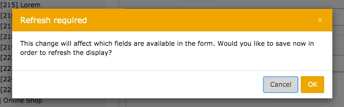
In the general Plug-In, click in the field under Selected Plugin and select the desired option from the list that appears with a left-click. A context window informs you that a change will affect the available fields. Select OK. The next steps depend on which plugin you have chosen.
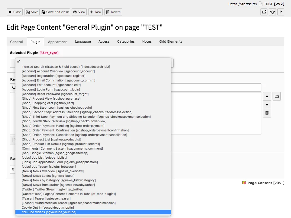
In the list of plugins you will find only one plugin that cannot be inserted as separate content element: We present the plugin Email Confirmation in the Account Content Elements.

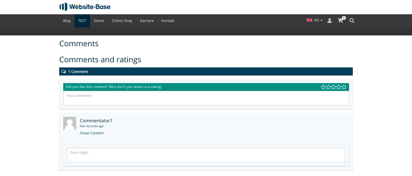
Comment columns allow users to express opinions, criticism or praise. The Comments plugin can be configured according to your wishes in just a few steps. If you want to add the content element, you will encounter the speech bubble icon. Since this is a plugin, the cube symbol is displayed in the content area.
Tab Plugin
This tab is divided into further tabs. Here you will find all options for setting the comment plug-in.
Sub-tab General
Mode
The options Page comments and Extension comments are available in the drop-down menu. The modes differ in how the thread identifier can be defined.
Unique Thread Identifier
A thread is a course of a conversation or the sequence of comments and answers. A thread identifier is only necessary if a thread occurs several times on the page. This means that if you want to insert several comment plugins on a page and want them to be independent of each other, you should fill in the identifier. This must be unique. An empty identifier is replaced by the current page ID. If a thread is to be displayed on several pages, simply insert the comment element with the same thread identifier on the relevant pages.
If you are in Page comments mode, enter a unique identifier here. In Extension comments mode, you can enter several threads separated by a comma.
Enable user notifications
This setting allows users to be notified when a new comment is posted. By default, a check mark is set here, which means that the option is active.
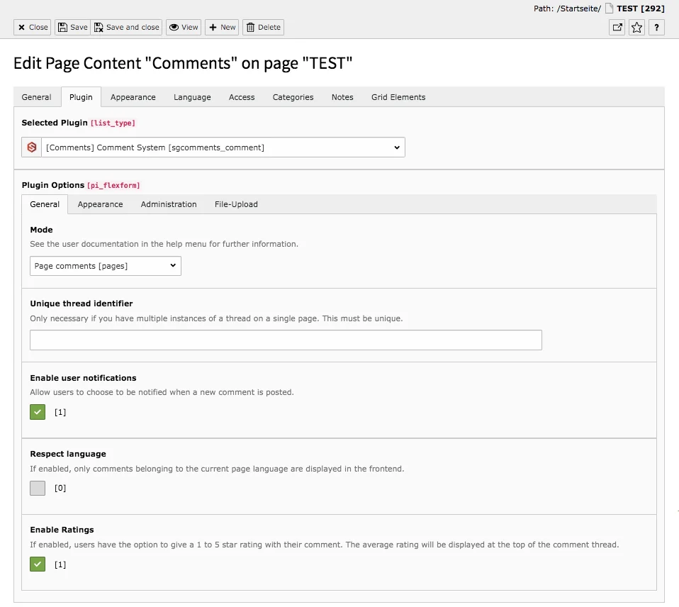
Respect language
If the option is activated, only comments that belong to the page language selected are displayed in the frontend. This is not activated by default.
Enable Ratings
If the option is enabled, users have the option to give a 1-5 star rating with their comments. The average rating is displayed above the comment thread. This setting is enabled by default.
Sub-tab Appearance
Display the latest comments at the top of the thread
The option is already activated when the plugin is created. If you do not check this box, the comments will be displayed chronologically, starting with the oldest comment.
Enable slim view
When this setting is activated, only the most basic elements (comments, ratings and text fields for new comments) are displayed. It removes the comment counter, average rating (if enabled), heading, and button for disabling notifications. The slim view is disabled by default.
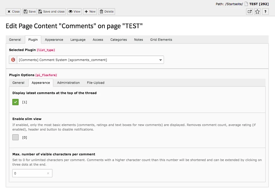
Max. Number of visible characters per comment
If you set the number to 0, there is no limit to the number of visible characters per comment. For any other number, comments with a higher number of characters are displayed in shortened form. By clicking on three dots at the end of comments, they can be expanded.
Sub-tab Adminstration
Allow only logged in users to write comments
Before users can leave comments, you must register on your site and log in. Users who are not logged in can see comments, but cannot write any. When creating the content element this setting is activated.
Users who are not logged in may only comment if they provide an email address
Those who are not registered on your site can leave comments if an e-mail address is provided. This option is also already active when creating the item. However, if users must log in to comment, this option has no effect.
Enable replies to individual comments
The enabled option allows users to not only comment, but also react to existing comments.
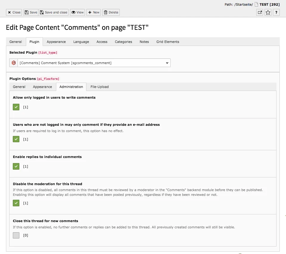
Disable the moderation for this thread
If this option is disabled, all comments in this thread must be reviewed by a moderator in the Comments module before publication. If you enable this option, all comments that have been posted previously will be displayed, regardless of whether they have been reviewed or not. By default, no check mark is set under this setting.
Close this thread for new comments
If this option is enabled, no further comments or replies can be added to this thread. All previously created comments are still visible.
Sub-tab File-Upload
Enable file upload
This option allows users to attach a file to their comments, which is enabled by default.
Max. number of files per comment
These specify how many files can be uploaded per comment. If you do not want files to be attached, simply uncheck Enable file upload.
Allowed file extensions
Determine which file types commentators are allowed to upload. When creating the plug-in, all possible file extensions are entered: gif, jpg, jpeg, pdf, png, docx, doc. If necessary, delete the unwanted file types in the field.
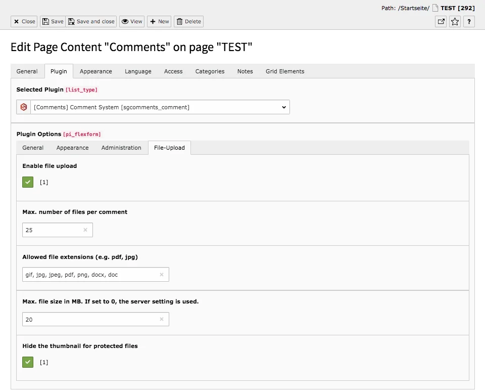
Max. file size in MB
Decide on the maximum size of the files that can be uploaded in the comments.
Hide the thumbnail for protected files
If you do not want protected files to be displayed in the preview, keep the check mark activated at this point.
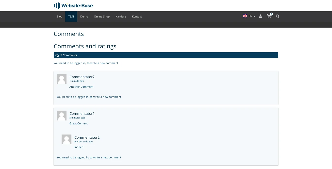
Comments in Frontend

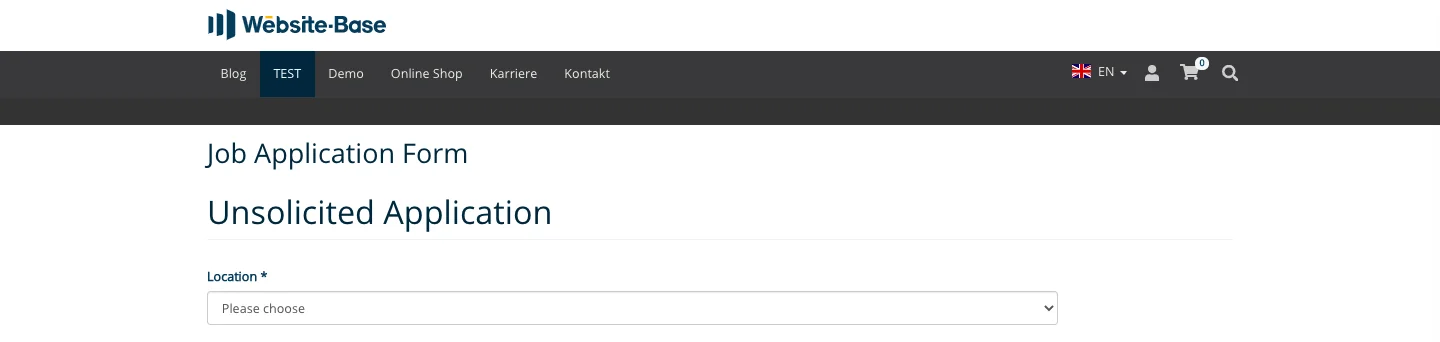
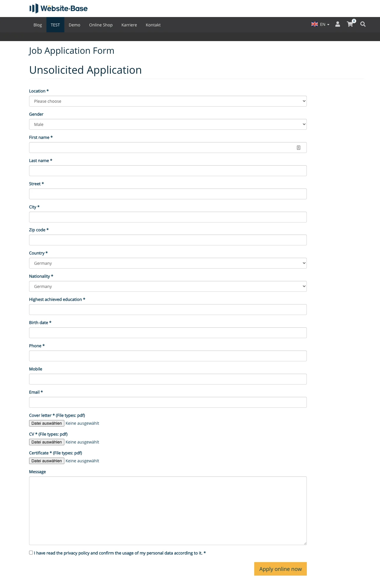
If you want to place job advertisements and accept applications via your website, you will find useful tools for this purpose in our TYPO3 Website Base. The Job Application Form plugin renders an input mask for unsolicited applications. With a few clicks the form is ready for use.
Tab General
As described above, you can assign a title to the element on the General tab. In addition, the title 'Unsolicited Application' is generated automatically. As the picture shows, two headings are then displayed above each other. To avoid this, you can hide the header you entered manually.
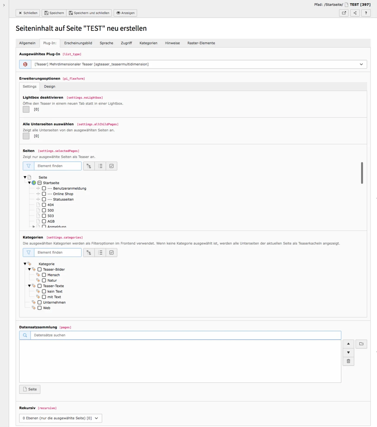
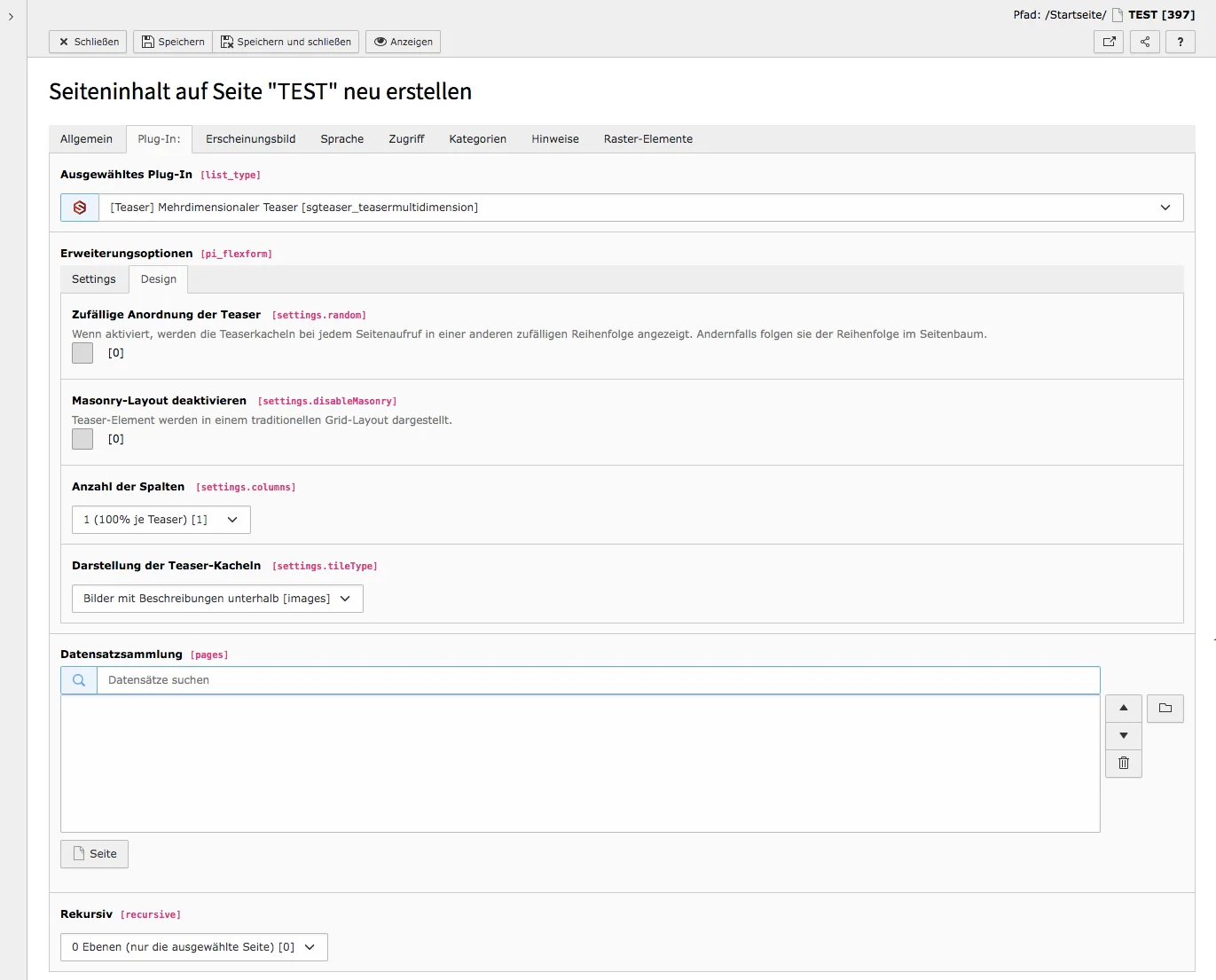
Tab Plugin
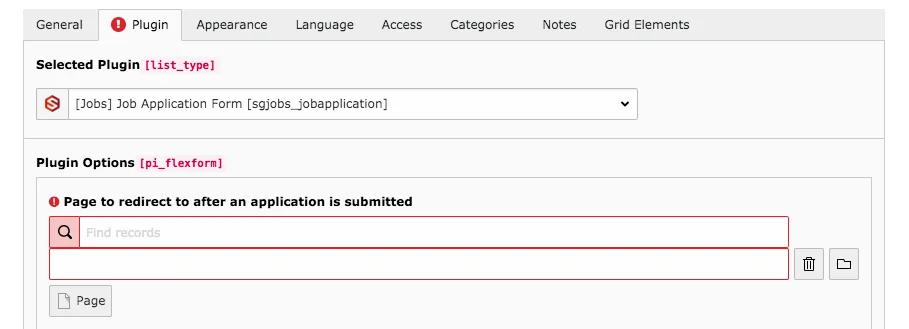
A red exclamation mark when the application form is created indicates that necessary information is still missing. In the case of an unsolicited application element, a page must be specified to which the application will be forwarded once it has been sent.
Under Plugin Options, simply click on the Page button or on the folder icon to the right of the field. In the context menu that appears, select the page to which you want to link after the application.
You should then link to the privacy policy page. The note is automatically inserted by the plugin, you must insert the link yourself at this point. To do so, click on the link icon and select the page with the data privacy policy.
If you also want the unsolicited application to have the same choice of locations (and therefore the same contact details) as the regular application forms, add the page or folder under Record Storage Page where the relevant data is located. Normally, the locations/companies and contacts are created in the folder for job advertisements. You can only see the contacts and companies in the list view. Here you can also add new data or edit existing records.
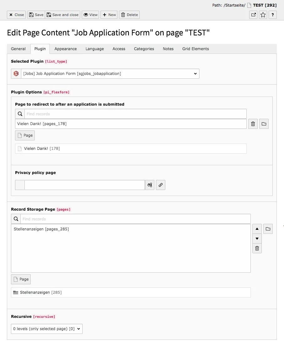

You will find the submitted applications in the Application record, which you can also see in the List module. In the Website Base, this data set is created in the Unsolicited Application page.
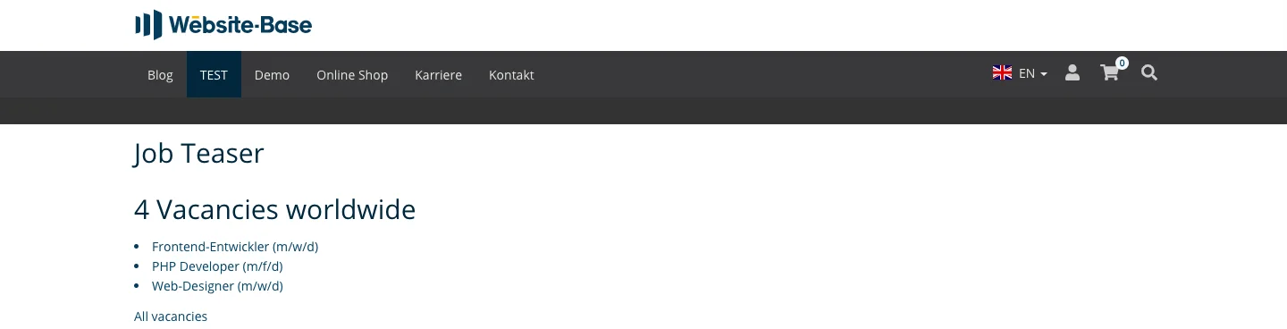
Application form - Unsolicited application in the frontend

Job Application Form in Frontend
The plugins job application form, job list and job teaser belong to the TYPO3 extension sg_jobs along with the backend module job offers. We also created a tutorial for the module for editors.
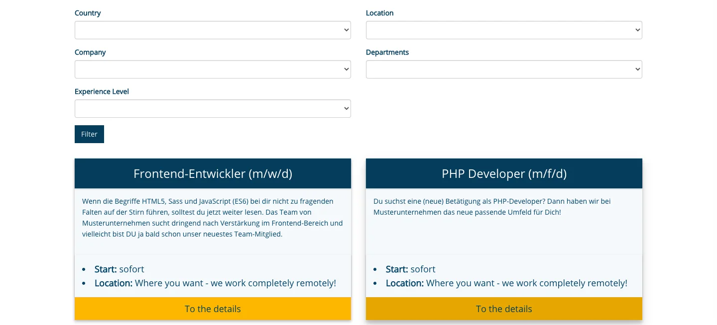
The job list generates an input mask and a list of all job offers. Potential applicants can easily filter the offers. This is a great advantage if there are a lot of job offers available. Because interested parties can quickly gain an overview of all relevant jobs.
Tab Plugin
Page containing the application form
Add here for example the page Career or unsolicited application. To do this, click on the Page button or the folder icon to the right of the field. Select the appropriate page from the page tree in the context menu.
Number of offers per page
Enter the number of job advertisements that will be displayed at once. Limiting the number of ads per page helps interested parties to keep an overview of the job offers.
Sorting of job offers
Manual sorting is set by default. If you prefer a different one, click in the field below the heading, and three options will appear in the drop-down menu: Alphabetically by job title, Manual (job offers are sorted as in the Job Offers module), By creation date.
Respected locations, Respected areas, Experience level filter
If you do not want to display all job offers in the list, but only certain locations, areas and/or experience levels, you can set the necessary filters here.

Record Storage Page
Select the page or folder that contains the records by which jobs can be filtered, such as location, company or work experience.
Job List in Frontend
The plugins job application form, job list and job teaser belong to the TYPO3 extension sg_jobs along with the backend module job offers. We also created a tutorial for the module for editors.

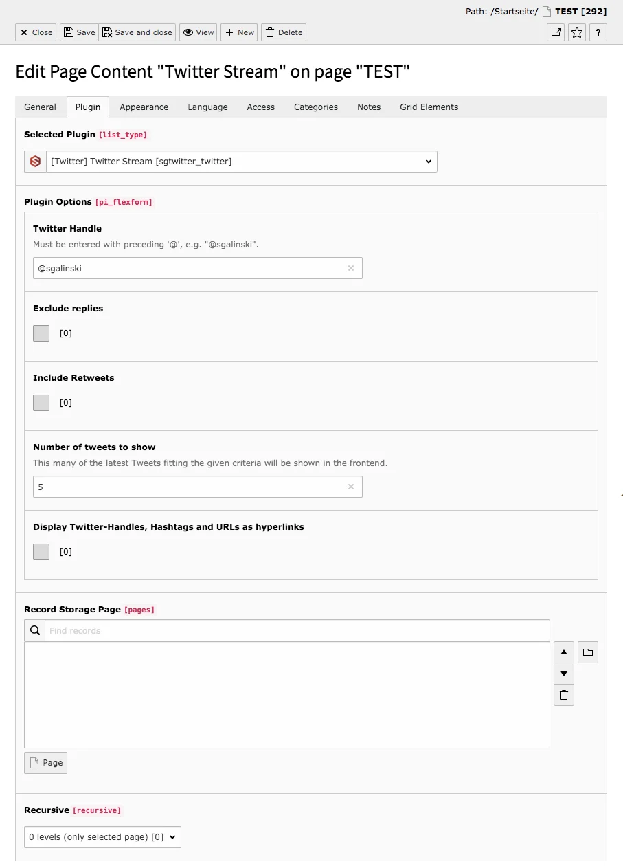
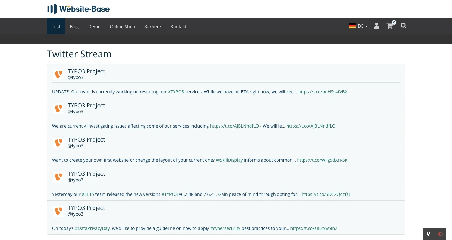
The plugin Twitter Stream allows you to display a Twitter stream on a website with just a few clicks. All you need to do is enter the unique user name. If you want to add the content element in the backend, you will find the Twitter icon, but in the content area the element is marked by the plugin icon.
Tab Plugin
Plugin options
Twitter Handle
Twitter Handle or username is the crucial information for a working Twitter stream. The username always starts with @. In contrast to the profile name, which can be assigned arbitrarily, the user name is unique. The profile name is always the first thing you see, below it you will find the Twitter handle, which you can recognize by the @ sign.
Exclude replies
If you want to display only tweets and no related responses in the stream, check this box. By default, none is set.
Include Retweets
Retweets are not activated when the plugin is created. If you also want to display retweets, activate the option by placing a check mark at this point. If retweets are displayed, it may happen that hardly any posts from the specified profile are displayed, but only retweets from other profiles.
Number of tweets to show
Limit the number of tweets displayed in the frontend. Five tweets are predefined, but you can change the number as required.
Display Twitter-Handles, Hashtags, and URLs as Hyperlinks
This is not activated in the standard settings. If you want to have links in the tweets, check this box.
Twitter Stream in Frontend (Username, Hashtags & URLs as Links)
Technical documentation
The Twitter plugin is based on the sg_twitter extension. There is a technical manual for this TYPO3 extension, which is primarily intended for developers.
To the technical documentation

With the Pages/Content Elements in Tabs plugin, both entire pages and individual content elements can be displayed in tabs. Content from different pages and entire pages can be combined into a bundle of topics, for example.
Tab Plugin
Plugin Options
Mode
Three modes are available: ‘Show every content element on the current page as one tab each’, ‘Show every subpage of this page one tab each’, ‘Combined (show elements chosen below, one tab each)’. Try different options to get the best result.
Pages and content that shall be rendered as tabs
This is where you add the pages or individual contents that should be displayed as tabs. If you want to add a whole page as a tab, click the Page button below the white field or click the folder icon to the right of the field. To fill a tab with a content element, click the Page Content button or click the folder icon. When you click the icon, you can insert both pages and individual content items.
Overwrite tab titles
In this field you assign the tab titles. Separate the tab headings with a line break. You must enter one title per line. If a title is not to be overwritten, leave a blank line blank or fill it with DEFAULT. Empty lines at the beginning are ignored. So if you do not need to overwrite the first tab titles, but do need to overwrite the following ones, you must enter DEFAULT in the first line.
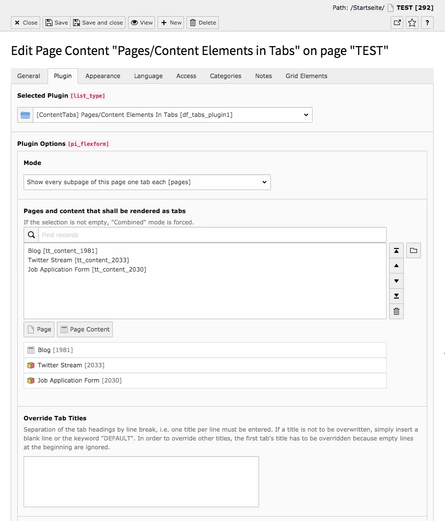
Hash
Hash is the name used to implement history and direct linking functions.
Pages/Content Elements in Tabs in Frontend
Our preview page shows how pages/content elements in tabs can look like in the frontend.

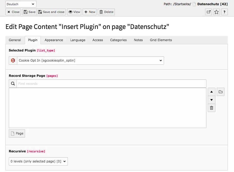
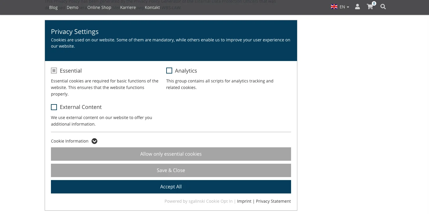
The sgalinski Cookie Opt In Extension also includes the plugin of the same name. With the Cookie Opt In content element you integrate the Cookie Consent window, which appears for every new visitor of your site, additionally on a page (e.g. on the privacy policy page).
Tab Plugin
Nothing needs to be set on the Plugin tab. The content element displayed in the frontend represents the configurations that you have made in the Tracking / Cookies module.
Cookie Opt In in Frontend
The Cookie OptIn plugin is integrated in our sg_cookie_optin TYPO3 extension. We have created a technical documentation and a product page for the extension, including a comprehensive manual for the configuration of the extension and the backend module Tracking / Cookies.
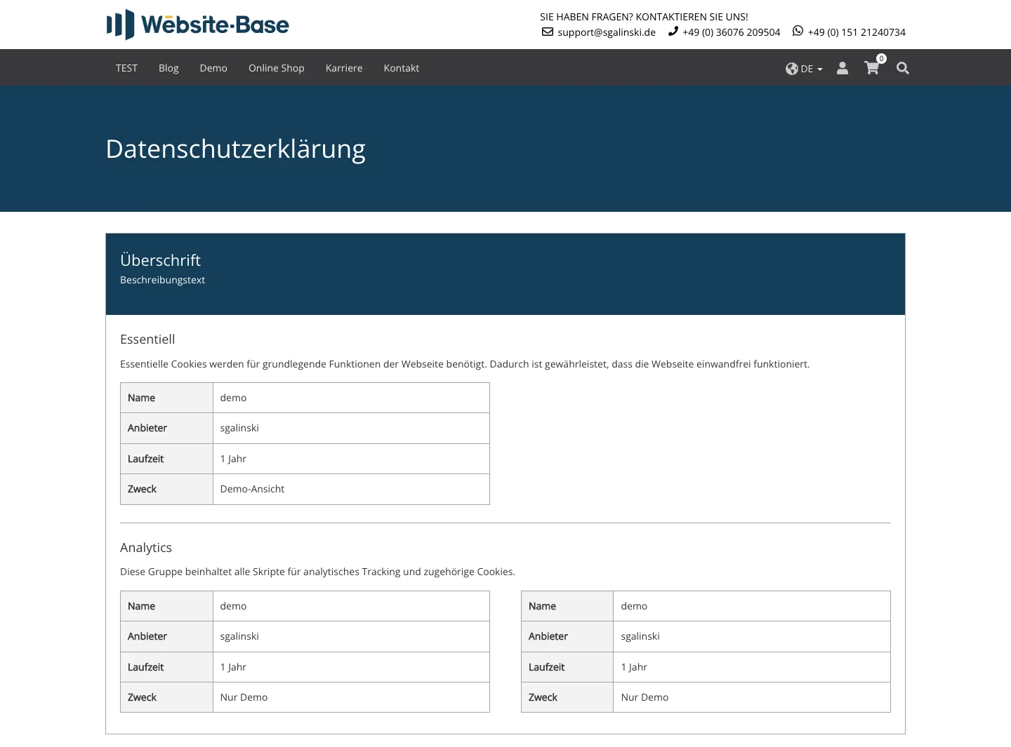
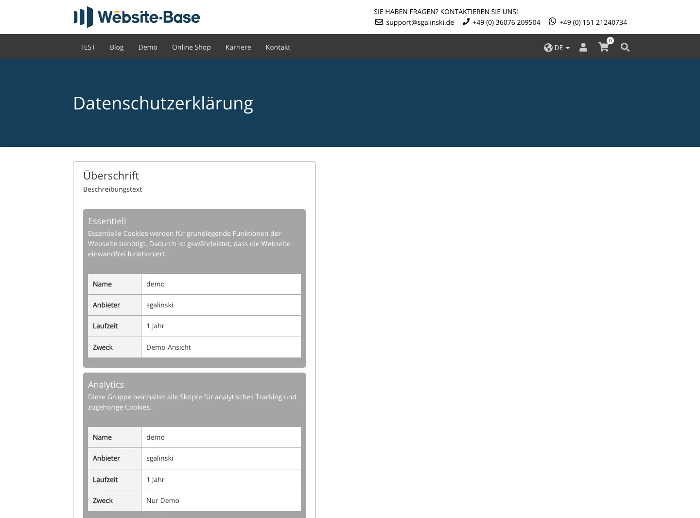
The sgalinski Cookie Opt In Extension includes the plugin of the same name and the Cookie-List. With the Cookie-List you can create a list of all registered cookies including their information. In addition, you can add a heading and description. Use the list e.g. on the privacy page.
Tab Plugin
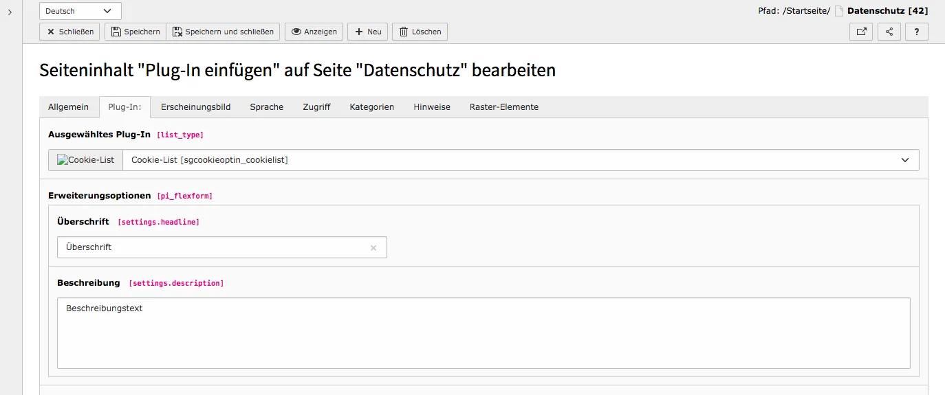
Cookie-List in Frontend
With the YouTube plugin, YouTube videos can be easily integrated without downloading videos and uploading them again in the system. In addition, the content element has various options that can be used to customize the display and behavior of the videos.
Tab Plugin
Settings
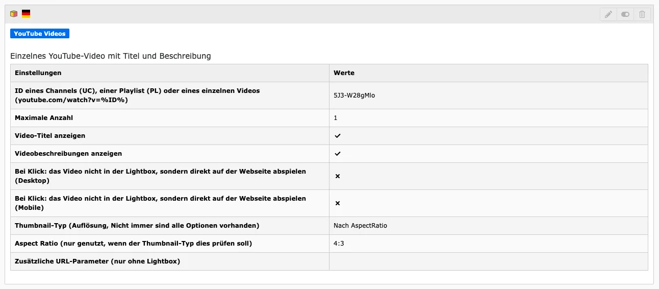
ID of Channel, Playlist or Single Video
Enter the ID of the channel, playlist or a single YouTube video here. If you want to enter multiple IDs, enter them separated by commas (ABCD_12, EFGH_34). In the YouTube IDs section we show where you can find the IDs.
Video is a “YouTube Shorts” video
Our video extension also allows you to use YouTube Shorts. To do this, you must activate the checkbox. Also make sure that you use a thumbnail type with a high resolution in the Appearance tab and select the 4:3 aspect ratio. If you use custom thumbnails, the images should have a ratio of 9:16.
IDs of the videos to exclude
If you do not want to show certain videos of a playlist or channel on your website, you can exclude them here. To do this, enter the corresponding IDs one after the other, separated by a comma (ABCD_12, EFGH_34).
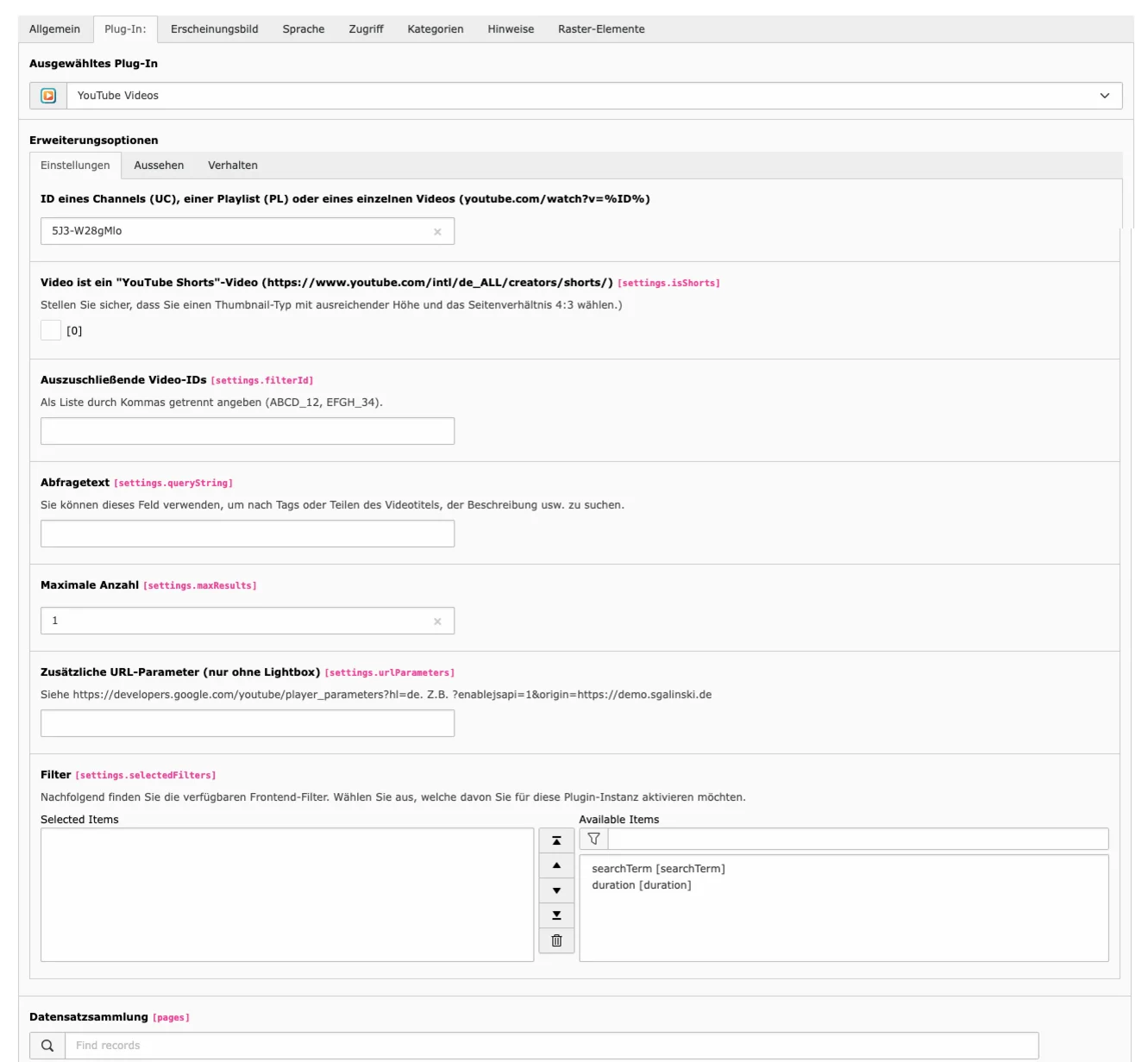
Query string
This field can be used if, for example, you do not want to include all videos of an entire channel, but only those with specific content, topics or tags. To do this, enter the desired terms separated by commas.
Maximum Amount
Decide the maximum number of videos to display and enter the desired number. Please note that some layouts only work with or above a certain number of videos (see Layout type at the 'Appearance' section).
Additional URL parameters
For further customization of the embedded videos you can use YouTube Player parameters. The parameters work only when videos are played directly on the page. For more information, see: https://developers.google.com/youtube/player_parameters.
Filters
If you integrate a particularly large number of videos, filters can be useful. Depending on the configuration, various filters are available to you in the right-hand field. Click on the desired filter(s). These now appear in the left-hand field and are displayed in a form after saving in the frontend so that users can interact dynamically with the displayed videos, e.g:
- Search term: Allows users to enter a search term to filter videos by keywords. (The search term filter does not work for YouTube playlists).
- Duration filter: Provides a drop-down menu to filter videos by length (short, medium, long, etc.).
The filter values are sent to the YouTube API and the video list is updated based on the selected criteria.
IMPORTANT: Follow these two steps if you want to use filters!
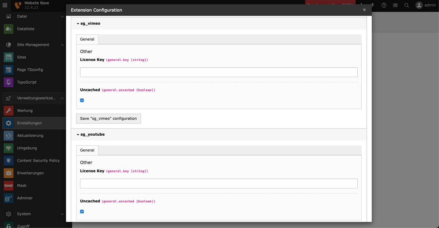
- In the TYPO3 backend, go to the Settings module (Admin tools section) and click Configure extensions. Click on sg_youtube, check the uncached checkbox and save. This way the extension will not cache the results and the data will be loaded dynamically based on the filter settings.
- Furthermore, you must deactivate the TYPO3 cHash parameter validation in your configuration and set
$GLOBALS['TYPO3_CONF_VARS']['FE']['cacheHash']['enforceValidation'] = false.

Appearance
Layout Style
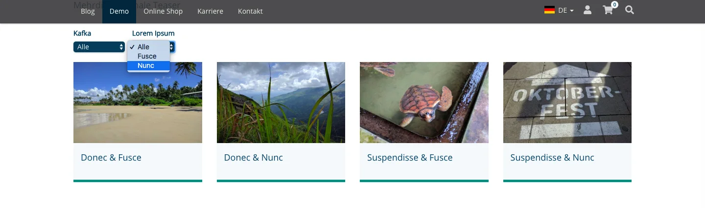
You can select the standard, row or playlist layout. There is also the single video layout, which is used automatically when you embed only one video. It's also important to note that the standard and row layouts work with two or more videos, and the playlist layout works with four or more videos. We present how these look on our preview page.
Show Videos Titles & Show Video Descriptions
These checkboxes allow you to specify whether to show titles or descriptions of the video. If you don't show titles and/or descriptions, you don't need to set a character limit.
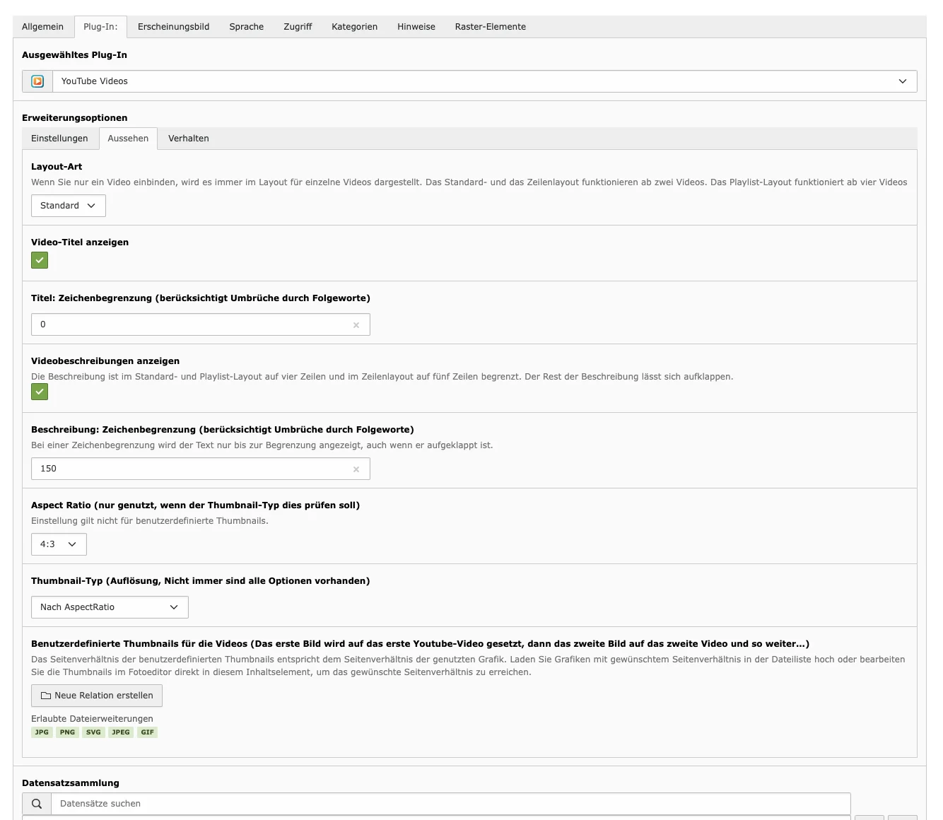
Character limit for title & description
Titles and descriptions of videos can be of different length, that's why you can set a character limit for title and description. The plugin will not stop in the middle of the word, but will consider whole words. By default, the value '0' (zero) is entered, with this setting there is no limit to the number of characters.
Regardless of the number of characters, the lines of the description are limited: four lines for the single video, standard and playlist layout, and five lines for the row layout. In the frontend, the rest of the description can be expanded using a button. Also note that if the description has a character limit, the text is always shown only up to the limit, even if you expand it.
Aspect Ratio
Specify the aspect ratio. The setting is only used when the thumbnail type should check it. This setting does not affect the aspect ratio of the custom thumbnails.
Thumbnail Type
Set the resolution from maximum to low. Not all options are always available.
Custom Thumbnails for the Videos
It is also possible to set your own thumbnail images for YouTube videos. The first image is placed over the first video, the second image is placed over the second video, and so on.
The aspect ratio of custom thumbnails is the same as the aspect ratio of the used image. Upload images with desired aspect ratio in the file list or edit the thumbnails in the photo editor directly in this content item to achieve the desired aspect ratio.
Behavior
Play video not in the lightbox, but directly on the web page
By default, a video is played in a lightbox. You can specify here to play videos directly on the page.
Show API Result
Specify whether debug information should be displayed.

YouTube IDs
YouTube Channel ID
There are several ways to find out the channel ID, as through the URL the ID is no longer visible for some time. If it is the ID of your own YouTube channel, you can find the letters and number sequence in the advanced settings of the account. You can find instructions from Google on how to do this.
If you need the channel ID of any YouTube channel, you need to open the desired channel in YouTube. Click on 'more' in the channel description and then click on Share channel in the window that appears. There you will find the option 'Copy channel ID'. You can then paste the copied ID into the YouTube extension.
You then simply paste the channel ID into the plug-in and make any other settings you need.
ID of YouTube Playlist
To add a playlist ID, copy from the playlist link everything that comes after list= and paste it into line for the ID.
- Playlist-Link:
www.youtube.com/watch?v=rrVDATvUitA&list=PLmhUZw8WWzebYTvtVWHkb_YMgKARy6UON - Playlist-ID:
PLmhUZw8WWzebYTvtVWHkb_YMgKARy6UON
ID of YouTube Video
To add a video ID, copy from the link of the video everything that comes after watch?v= and paste it into line for the ID.
- Video-Link:
www.youtube.com/watch?v=IBAhAk0-sPo - Video-ID:
IBAhAk0-sPo
Content Area
In the content area you will see an overview of the settings you have made in the YouTube plugin.
YouTube in Frontend
Depending on the settings chosen in the plugin, videos, playlists and channels can look very different. On our preview page you can see some examples showing how different settings affect the look in the frontend.
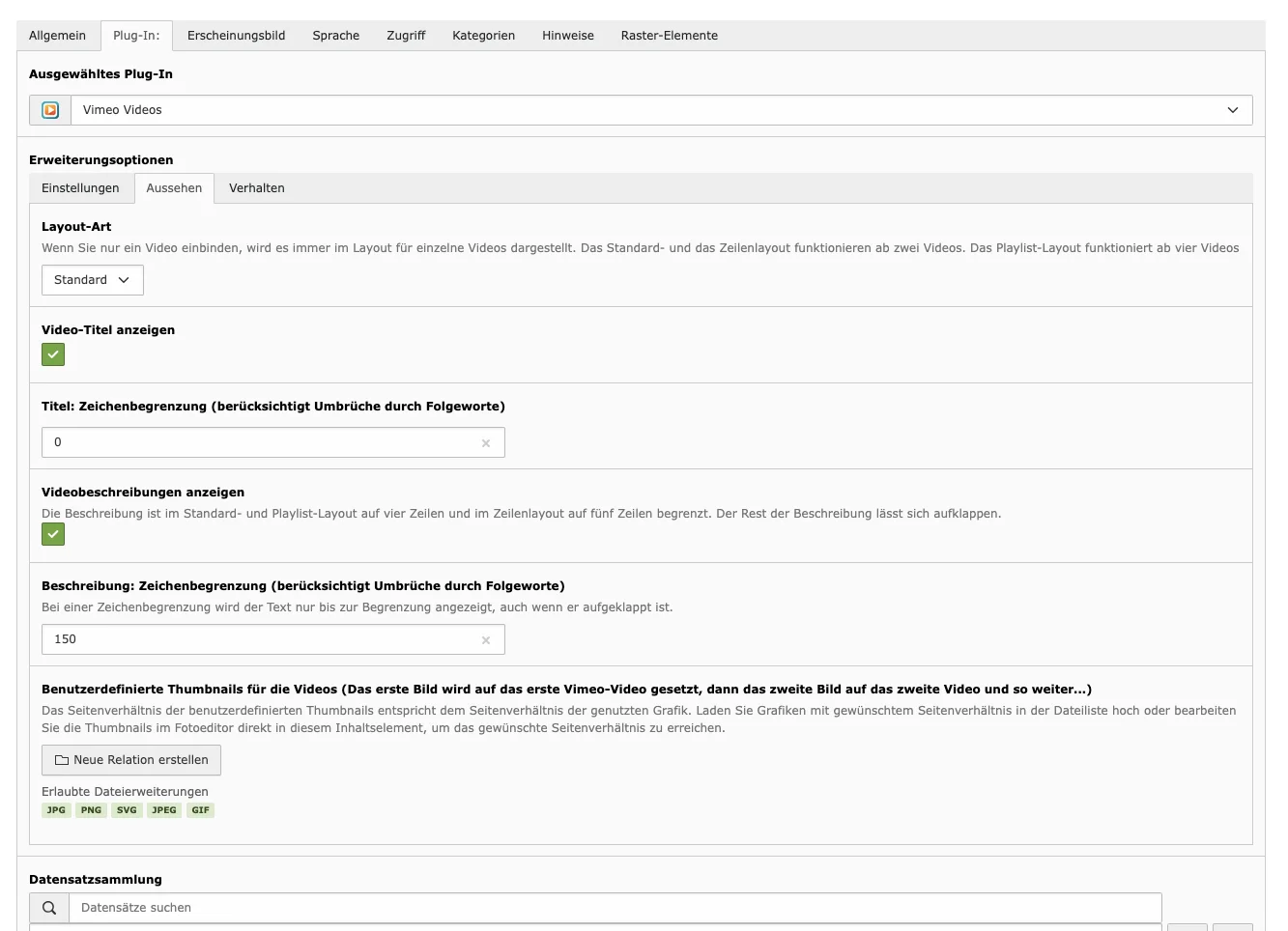
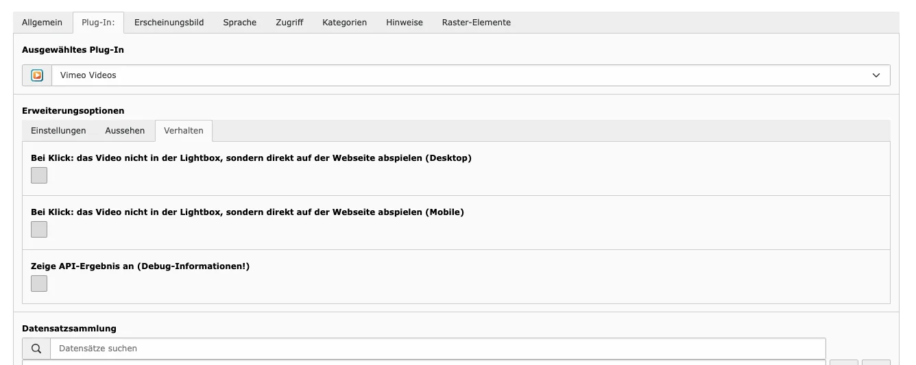
With the Vimeo plugin, Vimeo videos can be displayed on a TYPO3 page without having to download videos and upload them again in the system. Also, like the YouTube plugin, the content element has various options that allow you to customize the appearance and behavior of the videos.
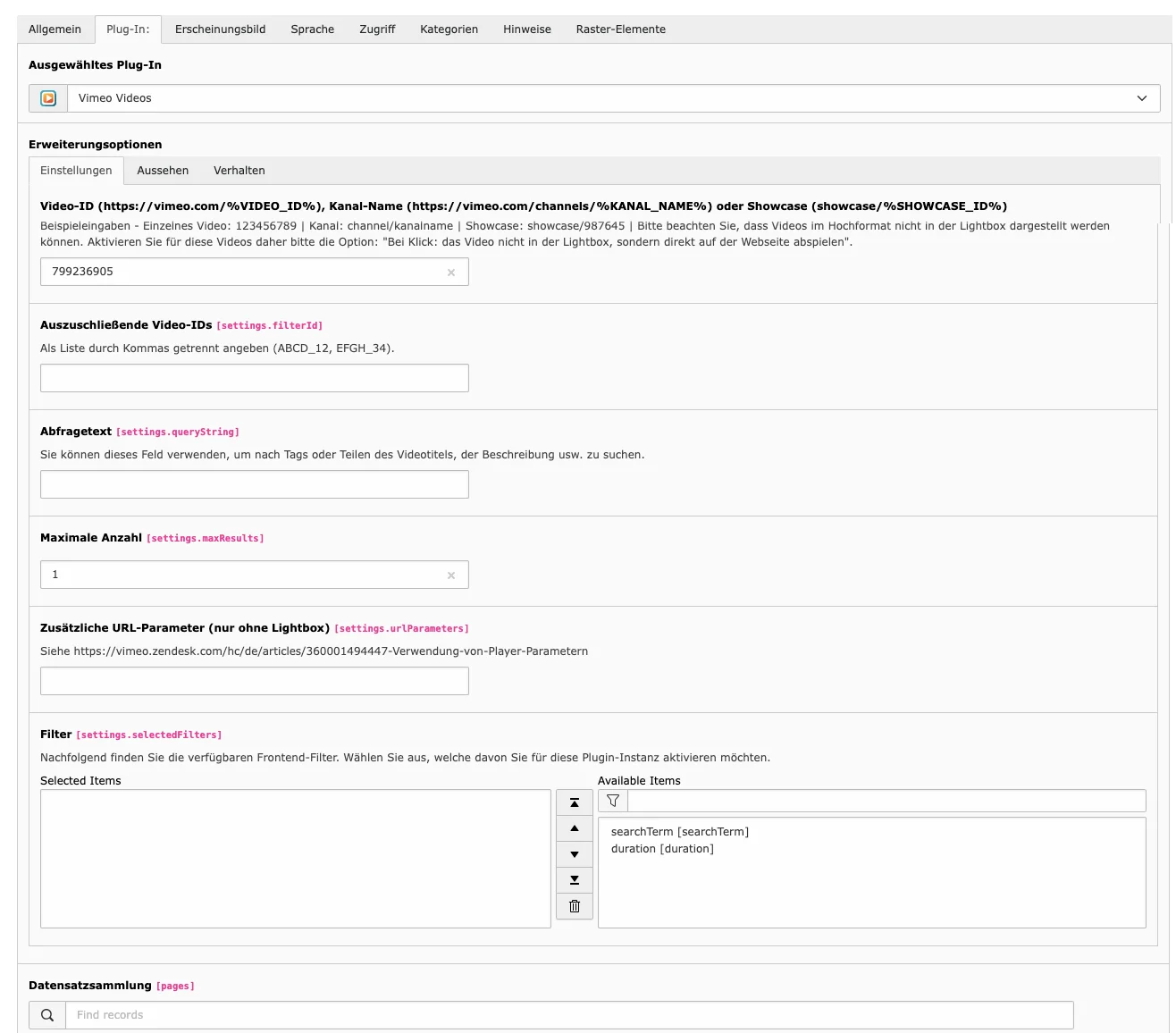
Tab Plugin
The following options are available. These are similar to the options for the YouTube plugin. When editing the Vimeo content element, you can therefore follow the YouTube instructions.
Settings
- Video ID, channel name, showcase: In the Vimeo IDs section we show where to find the IDs.
- IDs of the videos to exclude
- Query string
- Maximum Amount
- Additional URL parameters: As with YouTube, you can use parameters for further customization. This only works when videos are played directly on the page. You can find more information about parameters at: https://help.vimeo.com/hc/en-us/articles/12426260232977-About-Player-parameters.
- Filters
Appearance
- Layout Style
- Show Videos Titles & Show Video Descriptions
- Character Limit for Title & Description
- Custom Thumbnail for the Videos
Behavior
- Play video not in the lightbox, but directly on the web page
- Show API Result
Vimeo Video IDs
Vimeo Channel Name
NOTE: Vimeo has restricted the use of channels for visitors from the EU and the UK.
It may not be possible to view videos even if you have used a valid channel ID.
To add a channel name, copy from the link of the channel everything that comes after vimeo.com/channels/ and paste it into line for the ID/name.
- Channel-Link:
vimeo.com/channels/staffpicks - Channel Name:
staffpicks
Vimeo Showcase ID
To add a video ID, copy from the link of the video everything that comes after vimeo.com/showcase/ and paste it into line for the ID.
- Showcase Link:
vimeo.com/showcase/vimeocanhelp - Showcase ID:
vimeocanhelp
Vimeo Video ID
To add a video ID, copy from the link of the video everything that comes after vimeo.com/ and paste it into line for the ID.
- Video Link:
vimeo.com/246107487 - Video ID:
24610748
IMPORTANT: You must make sure that the user associated with the clientId and clientSecret API keys has the right permissions to search in the channel where the filters are being used. Otherwise, searching for a query string will always result in an empty result set.
Content Area
In the content area you will see an overview of the settings you have made in the Vimeo plugin.

Vimeo im Frontend
Depending on the settings made, the result in the frontend can look very different. In our preview page you can see some examples of this.
With the Vimeo plugin, Vimeo videos can be displayed on a TYPO3 page without having to download videos and upload them again in the system. Also, like the YouTube plugin, the content element has various options that allow you to customize the appearance and behavior of the videos.
Tab Plugin
The following options are available. These are similar to the options for the YouTube plugin. When editing the Vimeo content element, you can therefore follow the YouTube instructions.
Settings
- Video ID, channel name, showcase: In the Vimeo IDs section we show where to find the IDs.
- IDs of the videos to exclude
- Query string
- Maximum Amount
- Additional URL parameters: As with YouTube, you can use parameters for further customization. This only works when videos are played directly on the page. You can find more information about parameters at: https://help.vimeo.com/hc/en-us/articles/12426260232977-About-Player-parameters.
- Filters
Appearance
- Layout Style
- Show Videos Titles & Show Video Descriptions
- Character Limit for Title & Description
- Custom Thumbnail for the Videos
Behavior
- Play video not in the lightbox, but directly on the web page
- Show API Result
Vimeo Video IDs
Vimeo Channel Name
NOTE: Vimeo has restricted the use of channels for visitors from the EU and the UK.
It may not be possible to view videos even if you have used a valid channel ID.
To add a channel name, copy from the link of the channel everything that comes after vimeo.com/channels/ and paste it into line for the ID/name.
- Channel-Link:
vimeo.com/channels/staffpicks - Channel Name:
staffpicks
Vimeo Showcase ID
To add a video ID, copy from the link of the video everything that comes after vimeo.com/showcase/ and paste it into line for the ID.
- Showcase Link:
vimeo.com/showcase/vimeocanhelp - Showcase ID:
vimeocanhelp
Vimeo Video ID
To add a video ID, copy from the link of the video everything that comes after vimeo.com/ and paste it into line for the ID.
- Video Link:
vimeo.com/246107487 - Video ID:
24610748
IMPORTANT: You must make sure that the user associated with the clientId and clientSecret API keys has the right permissions to search in the channel where the filters are being used. Otherwise, searching for a query string will always result in an empty result set.
YouTube IDs
YouTube Channel ID
There are several ways to find out the channel ID, as through the URL the ID is no longer visible for some time. If it is the ID of your own YouTube channel, you can find the letters and number sequence in the advanced settings of the account. You can find instructions from Google on how to do this.
If you need the channel ID of any YouTube channel, you need to open the desired channel in YouTube. Click on 'more' in the channel description and then click on Share channel in the window that appears. There you will find the option 'Copy channel ID'. You can then paste the copied ID into the YouTube extension.
You then simply paste the channel ID into the plug-in and make any other settings you need.
ID of YouTube Playlist
To add a playlist ID, copy from the playlist link everything that comes after list= and paste it into line for the ID.
- Playlist-Link:
www.youtube.com/watch?v=rrVDATvUitA&list=PLmhUZw8WWzebYTvtVWHkb_YMgKARy6UON - Playlist-ID:
PLmhUZw8WWzebYTvtVWHkb_YMgKARy6UON
ID of YouTube Video
To add a video ID, copy from the link of the video everything that comes after watch?v= and paste it into line for the ID.
- Video-Link:
www.youtube.com/watch?v=IBAhAk0-sPo - Video-ID:
IBAhAk0-sPo
Content Area
In the content area you will see an overview of the settings you have made in the Vimeo plugin.
Vimeo im Frontend
Depending on the settings made, the result in the frontend can look very different. In our preview page you can see some examples of this.
Would you like to know more?
All information about the available editions can be found on the webpage for our TYPO3 Website-Base. You have the possibility to get a Website at a Fixed Price or you decide for a Website as a Service package, with which no further costs for hosting or security and function updates will come up to you.
